


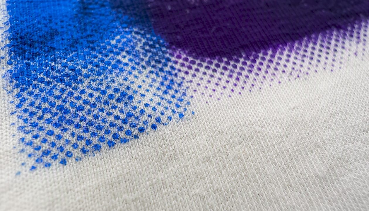
A halftone converts a continuous-tone image into a grid of dots that vary in size, tricking the eye into seeing shades of gray or color where only one ink is actually printed. For a standard cotton T-shirt, start with round dots and a moderate LPI suitable for general cotton printing, paired with a 300 DPI source image and an appropriate mesh count for typical garment printing. This combination works reliably across most plastisol setups and provides a solid baseline before adjusting for specific substrates or ink systems.
Here are key settings to consider before you open Photoshop:
- LPI (lines per inch): select an LPI appropriate for your substrate, typically within the range suitable for cotton and similar fabrics
- DPI of source image: aim for a minimum of 300 DPI; use roughly 2.5 times the selected LPI for output resolution
- Mesh count: choose a mesh count compatible with your LPI, ideally maintaining a mesh-to-LPI ratio that supports clean dot transfer
The rest of this guide walks through the full workflow, from image prep in Adobe Photoshop through RIP software settings, file export, troubleshooting, and what to hand off to your screen shop.
Key Takeaways
Halftone screen printing works reliably when LPI, mesh count, and source resolution are matched correctly, dot gain is pre-compensated, and the shop receives a clean master file with clear notes.
| Point | Details |
|---|---|
| Start with the right settings | Use 45 LPI, round dot, 300 DPI source, and 160 mesh for standard cotton T-shirts. |
| Match mesh to LPI | Mesh count should be at least 3.5–4× your LPI; mismatched ratios cause sawtoothed or missing dots. |
| Cap shadow dots | Limit maximum shadow dot to 85–—% to prevent blocked shadows from dot gain on fabric. |
| Send lossless files | Export halftone output as TIFF or PNG; JPEG compression destroys dot edges and causes ghosting. |
| Tektonla production | Tektonla accepts both client-supplied halftones and RIP-processed masters for garment screen printing jobs. |
Table of Contents
- What halftone screen printing actually does to your image
- Step-by-step workflow: converting an image for halftone screen printing
- Key design terms and how to choose your settings
- Quick reference: mesh, LPI, and DPI for garment printing
- What to send your screen shop: the file prep checklist
- Common halftone problems and how to fix them
- AM vs. FM screening and dot-shape tradeoffs
- How to proof halftones before a production run
- Tektonla handles the production side so you can focus on the design
- Sources
What halftone screen printing actually does to your image
Screen printing is a binary process. Ink either passes through the mesh or it doesn’t. There’s no way to lay down a lighter or darker version of the same ink in a single pass. Halftones solve that problem by replacing continuous tones with a grid of dots, where small dots represent highlights and large, nearly-touching dots represent shadows. At normal viewing distance, your eye blends the dots and reads them as a gradient.
The technical term for the standard approach is amplitude-modulated (AM) screening: dots are arranged on a fixed grid, and tonal value is controlled by changing dot size, not dot position. The alternative, frequency-modulated (FM) or stochastic screening, places dots randomly rather than on a grid, which eliminates the regular pattern but demands tighter process control.
Key terms you’ll encounter throughout this guide:
- LPI (lines per inch): the frequency of the halftone grid; higher LPI = finer detail but more demanding on mesh and exposure
- DPI/PPI: the resolution of your source or output file; governs how much detail the halftone can capture
- Mesh count: threads per inch on the screen; sets the upper limit on how fine a halftone you can print
- Dot gain: the physical spread of ink beyond the dot edge during printing; a 50% film dot can print at 68–85% tone on fabric without compensation
- Screen angle: the rotation of the halftone grid; prevents dots from aligning with mesh threads and causing moiré
- Dot shape: round, elliptical, square, or line; each behaves differently in midtones
The midtone jump is worth calling out specifically. That transition can look like a sudden density shift rather than a smooth gradient, and it’s one of the most common complaints on halftone garment prints.
Step-by-step workflow: converting an image for halftone screen printing
This workflow covers Adobe Photoshop first, then notes on RIP software for production output. Follow the steps in order; skipping the prep stages is where most halftone problems originate.
Before you open the halftone dialog
- Start with a high-contrast, continuous-tone source. Avoid images that are already halftoned (scanned from a printed piece) or heavily compressed JPEGs. Artifacts in the source become amplified in the halftone.
- Set source resolution to 300 DPI minimum at the final print size. If you’re printing at 12 inches wide, your file should be 3,600 pixels wide at minimum.
- Adjust levels and curves. Boost contrast so highlights are clean and shadows have definition. A flat, low-contrast image produces a muddy halftone.
- Remove any existing halftone pattern using Photoshop’s Filter > Blur > Gaussian Blur (just enough to soften the dot pattern), then sharpen lightly with Unsharp Mask. Re-halftoning an already-halftoned image creates moiré almost every time.
Photoshop halftone conversion
The Photoshop workflow follows a specific sequence through Image > Mode:
- Image > Mode > Grayscale. Flatten and discard color if prompted. For multi-color separations, work channel by channel.
- Image > Mode > Bitmap. Set the output resolution. Use the rule of thumb: output DPI ≈ 2.5× your target LPI. For 45 LPI, set output to 112–115 DPI; for 55 LPI, use 137–140 DPI.
- In the Bitmap dialog, choose Halftone Screen as the method.
- Set Frequency (your LPI), Angle, and Shape. For a single-color garment print, 45° is the standard angle. Round dot is the safe default shape.
- Click OK. Photoshop renders the halftone bitmap.
- Save two files: the original grayscale (or layered PSD) as your master, and the halftoned version as a lossless TIFF. Never save halftone output as JPEG — compression destroys the dot edges.
A few practical notes on the Photoshop path: the Bitmap mode dialog gives you a preview, but it’s small. Also, name your files to communicate settings: design_45lpi_160mesh_round.tif tells the shop everything they need at a glance.
When to use RIP software instead
RIP (Raster Image Processor) software handles halftoning at the output stage, after your file leaves Photoshop. Most production shops run a RIP for film output, and many prefer to re-halftone client files themselves to match their specific press conditions.
RIP advantages over Photoshop halftoning:
- Applies dot-gain compensation curves calibrated to the shop’s specific mesh, ink, and exposure setup
- Gives precise angle control to avoid mesh thread alignment
- Supports stochastic (FM) screening as a toggle
- Produces consistent output across a production run
If your shop uses a RIP, your best move is to supply a clean, non-halftoned grayscale master alongside your halftoned TIFF. That gives them the option to re-halftone to their own specs without losing your tonal intent. Coordinate with the shop before the job, not after.
Key design terms and how to choose your settings
Understanding what each variable does lets you make deliberate choices rather than guessing. Here’s what actually matters for garment work.
LPI: how fine is your halftone grid?
LPI sets the number of dot rows per inch. Lower LPI means larger, more visible dots; higher LPI means finer detail but more demanding on mesh and exposure. Practical guidance suggests using mesh count ÷ 5 as a standard LPI and mesh count ÷ 4 when pushing for detail under controlled conditions.
- 35–45 LPI: heavy cotton, fleece, textured fabric, or any substrate with significant surface texture
- 45–55 LPI: standard 100% cotton T-shirts, the most common garment range
- 55–65 LPI: premium garments, smooth substrates, fine-detail artwork
DPI/PPI: source resolution and output resolution
These are related but not the same. Your source file’s PPI determines how much detail exists to work with. Your output DPI (set in the Bitmap dialog) determines how finely Photoshop renders the halftone dots. The 2.5× rule is a reliable starting point: output DPI ≈ 2.5× LPI. A 45 LPI halftone needs roughly 112 DPI output resolution; a 65 LPI halftone needs about 162 DPI output.
Your source image should always be 300 PPI at final print size. Going lower risks visible pixelation in the halftone dots themselves.
Screen angle: preventing moiré
Moiré happens when the halftone grid aligns with the mesh threads, creating a visible interference pattern. Rotating the halftone grid off-axis breaks that alignment. For single-color prints, 45° is the standard because it places dots diagonally to both horizontal and vertical mesh threads. For CMYK process printing, each channel gets a different angle (typically C: 15°, M: 75°, Y: 0°, K: 45°) to prevent color moiré between channels.
Dot shape: round, elliptical, square, or line
Dot shape affects midtone behavior more than most designers expect. Here’s the practical breakdown:
- Round: the safest default; dots grow uniformly and are least likely to cause midtone jumps or moiré in uniform areas
- Elliptical/diamond: dots touch first along one axis, which can smooth the midtone transition but introduces a slight directional pattern
- Square: touches at all four corners simultaneously at 50%, creating a sharp midtone jump; use only for stylistic effects
- Line: produces a graphic, striped aesthetic; not suited for photorealistic halftones
Dot gain: the variable that breaks shadows
Dot gain is the physical spread of ink beyond the film dot during printing. Without compensation, a 50% dot on film can print at 68–85% on fabric. That means shadows block up and highlights disappear. Most RIPs apply this automatically; in Photoshop, you do it manually with a Curves adjustment before converting to Bitmap.
Quick reference: mesh, LPI, and DPI for garment printing
Use this table to match your mesh count to an appropriate LPI and confirm your source file resolution. Choose mesh first (your shop will often specify it), then pick LPI and verify DPI.
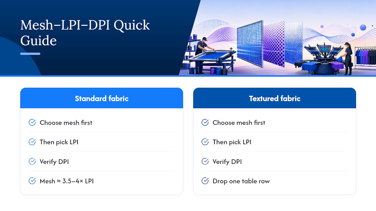
Pro Tip: On textured fabrics like French terry or pigment-dyed garments, drop one row in the table from what the mesh count suggests. Surface texture eats fine dots before they even reach the viewer’s eye.
The mesh-to-LPI ratio matters structurally, not just as a guideline. A mesh count that’s too low for your LPI causes dots to “sawtooth” at the edges or fail to transfer cleanly, especially in highlight areas where dots are smallest. Aim for mesh ≈ 3.5–4× LPI as a floor.
What to send your screen shop: the file prep checklist
Sending the right files the first time eliminates most of the back-and-forth that delays production. Here’s what a well-prepared halftone submission looks like.
Files to include
- Master PSD or AI file with all layers intact and text converted to outlines
- Halftoned TIFF or PNG (lossless, never JPEG) at the correct output DPI
- Spot color separations as individual files if the design uses more than one color
- Underbase layer as a separate file for dark garments; typically a white flood or choked halftone
- Registration marks on all separation files, aligned to the same origin point
- Overprint and trap notes in a text file or embedded in the file notes
File format guidance
PNG and TIFF preserve halftone dot edges without compression artifacts. JPEG’s lossy compression rounds off dot edges and introduces ringing around high-contrast areas, which shows up as ghosting or blurring in the printed dot. Print file best practices consistently point to lossless formats for any halftone work.
File naming convention
Use a consistent naming pattern so the shop can identify settings without opening the file:
[DesignName]_[Color]_[LPI]lpi_[Mesh]mesh_[DotShape].tif
Example: SunsetGradient_Black_45lpi_160mesh_round.tif
Notes to include for the shop
- Intended substrate (garment type, fabric weight, color)
- Expected viewing distance (arm’s length for apparel vs. wall distance for posters)
- Maximum shadow dot percentage you’ve set (e.g., capped at 85%)
- Whether you expect the shop to re-halftone in their RIP or use your supplied halftone file
- Underbase instructions: flood white, choked halftone, or none
Common halftone problems and how to fix them
Most halftone issues trace back to one of four root causes: wrong angle, too much dot gain, poor exposure, or a source file that wasn’t ready for halftoning. Here’s how to diagnose and fix each.
- Moiré pattern visible in print: Change the halftone angle (try 22.5° or 67.5° instead of 45°), or switch to FM/stochastic screening. Also check that the mesh thread count isn’t a simple multiple of your LPI.
- Shadows blocking up (no detail in dark areas): Dot gain is running high. Cap maximum shadow dot at 85% and apply a dot-gain compensation curve. Lower exposure time slightly and check ink viscosity.
- Midtone jump (sudden density shift around 50%): Switch from square or round dots to elliptical or diamond. Elliptical dots touch along one axis first, smoothing the transition through the midtone range.
- Highlight dots disappearing: Two possible causes. First, underexposure: the fine dots in highlights aren’t fully polymerizing the emulsion, so they wash out. Increase exposure time for halftone screens compared to solid-color screens. Second, LPI is too high for the mesh; drop LPI by 5–10 lines.
- Dots look jagged or “sawtoothed” at edges: Mesh count is too low for the LPI you’re using. Either increase mesh count or reduce LPI. Mesh should be at least 3.5× LPI.
- Halftone looks fine on film but muddy on shirt: Source image lacked contrast before conversion. Go back to the grayscale master, boost contrast with Curves, and re-export. Also check ink opacity and squeegee pressure.
Pro Tip: Halftone screens need longer exposure than solid screens. The fine highlight dots are the first to wash out if exposure is short. When in doubt, run a step-wedge exposure test on a halftone screen before committing to a production burn.
AM vs. FM screening and dot-shape tradeoffs
The choice between AM and FM screening is less about aesthetics and more about what your shop’s process can support.
AM (amplitude-modulated) screening places dots on a fixed grid at a set angle. Tonal value changes by dot size. It’s predictable, well-understood, and works on any mesh count that matches the LPI. The downside is angle sensitivity: if the grid aligns with the mesh threads, moiré appears.
FM (stochastic) screening places dots randomly. There’s no grid to align with mesh threads, so moiré risk drops significantly. FM can also produce very fine highlight detail. The tradeoffs are real, though: FM requires higher mesh counts (typically 230+ for garment work), tighter exposure control, and more consistent ink viscosity. A shop that hasn’t dialed in their FM process will produce worse results than a well-run AM setup.
Dot-shape selection is frequently misunderstood. Shapes change midtone behavior but can raise moiré or visible patterning risks in uniform areas, so shape choice must match the image subject and substrate. Round dots are the safest default for most garment halftone work; elliptical and diamond shapes offer smoother midtone transitions at the cost of a slight directional pattern that can become visible in flat-toned areas. Square and line dots are stylistic choices, not technical improvements.
— Screen Printing Magazine on dot-shape tradeoffs
Practical recommendation: use AM round dots for most garment work, as explained in Mixing Patterns: Hawaiian Shirts & Bold Prints - Dan Flashes. Switch to FM only when the shop explicitly supports it and the design genuinely needs it, such as a photorealistic portrait with fine highlight detail on a premium substrate. For bold graphics and apparel branding, AM at 45–55 LPI with round dots covers the vast majority of use cases. A crash course in halftones from ScreenPrinting.com reinforces this: LPI and angle choices drive most of the outcome, and dot shape is a secondary refinement.
How to proof halftones before a production run
A test print before the full run catches dot gain, exposure issues, and color shift before they cost you a full run of garments. Here’s a minimal but effective proof process.
- Output film and inspect at 100% zoom. Check that highlight dots are present and clean-edged. If dots are missing in the 5–10% range, exposure will wash them out entirely.
- Burn a test screen using your intended mesh and emulsion. Use a step-wedge exposure test to find the correct exposure time for halftone work (it will be longer than for solids).
- Print a swatch on the intended substrate at production settings: same ink, same squeegee pressure, same off-contact distance.
- Measure dot gain by comparing a known 50% film dot to the printed result. If the printed dot reads significantly darker, apply a compensation curve and reprint.
- Check edge definition in highlights and shadows. Highlight dots should be crisp; shadows should show separation between dots rather than a solid ink mass.
- Log the results and adjust before approving for production.
Use this swatch log to track variables across proof iterations:
| Variable | Value |
|---|---|
| Mesh count | e.g., 160 |
| LPI | e.g., 45 |
| Dot shape | e.g., round |
| Exposure time | e.g., 45 seconds |
| Squeegee pressure | e.g., medium |
| Ink type | e.g., plastisol, white |
| Substrate | e.g., 100% cotton, black |
| Measured dot gain | e.g., dot gain at 50% |
| Notes | e.g., reduce shadow cap to 85% |
If the shop’s RIP re-halftones your file, ask for a digital proof or a strike-off before the run. RIP re-halftoning changes dot gain behavior, and a file that looked right from Photoshop may need curve adjustments once the RIP applies its own screening.
What actually matters in production: a shop perspective
Most designers focus on LPI and dot shape, which are genuinely important. What gets overlooked more often is the conversation that should happen before any file is submitted.
At Tektonla, the preference is for a layered PSD master plus a halftoned TIFF with the LPI, mesh, and dot shape noted in the filename and in a short text note. That combination lets the production team decide whether to use the client-supplied halftone or re-halftone in the RIP to match the specific press setup. Neither approach is wrong; the right call depends on the substrate, the ink system, and how the shop’s exposure unit is calibrated.
The honest reality: RIP re-halftoning usually produces more consistent results across a run, because the RIP applies dot-gain compensation curves calibrated to the actual press. But when a designer has done careful tonal work in Photoshop and the shop’s RIP would alter that, supplying the halftoned file with clear notes is the better path. Tektonla’s screen printing services handle both workflows, and the team will flag if a submitted file needs adjustment before burning screens.
Tektonla handles the production side so you can focus on the design
Halftone screen printing done right requires clean files, accurate settings, and a shop that knows how to handle the nuances of dot gain and exposure. Tektonla’s Downtown Los Angeles production team works with both client-supplied halftones and RIP-processed masters, with fast turnarounds on garment screen printing jobs.
To submit a halftone job, send the following:
- Layered PSD or AI master file (with text outlined)
- Halftoned TIFF or PNG at the correct output DPI (lossless format only)
- LPI, mesh count, and dot shape noted in the filename or a separate text note
- Garment SKU or substrate description (fabric type, weight, color)
- Color references (Pantone or ink mix) and any underbase instructions
- Maximum shadow dot percentage if you’ve capped it in output
Tektonla’s Printers Shirt is a reliable blank for test prints before a production run. Ready to move forward? Submit your files and notes at Tektonla and the team will confirm settings before screens are burned.
Sources
- Halftone for Screen Printing — Beginner’s Complete Guide
- Dot Gain & Halftone in Screen Printing: Technical Guide | Dragonfly Colors
- Best Halftone Settings in Photoshop for Screen Printing - Cnding Group
- Choosing halftone dot shape — Screen Printing Magazine