


Use SVG for nearly everything you build for screens: websites, app icons, logos on social media, UI elements. Save EPS, or better yet PDF, for the rare printer or prepress house that still runs older PostScript workflows and demands CMYK or spot color separations. The two formats solve different problems, and picking the wrong one costs you rework, not just file size.
TL;DR:
- EPS remains essential for print workflows due to native support for CMYK and spot colors, but it lacks transparency and browser compatibility.
- SVG is ideal for web use because of its compatibility with browsers, CSS styling, and ability to handle interactivity and accessibility features.
- Converting between EPS and SVG can cause issues with embedded rasters, transparencies, and fonts, requiring careful manual cleanup.
- For web projects, export SVG with minimized size and proper viewBox, while print projects should prioritize PDFs with embedded color and bleed information.
- Always choose the file format based on the destination and software expectations, and treat exports as tailored translations rather than one-size-fits-all solutions.
Table of Contents
- EPS vs SVG: What EPS Actually Is and Why Print Shops Still Ask For It
- EPS vs SVG: What SVG Actually Is and Why the Web Runs on It
- EPS vs SVG: The Practical Differences That Actually Change Your Workflow
- How to Pick the Right Format for the Job in Front of You
- Converting Between EPS and SVG Without Breaking Your Artwork
- Which Software Actually Handles Each Format Well
- Export Settings That Save You a Reprint or a Broken Page
- What Tekton LA Asks Clients to Upload, and Why
- Why Designers Overthink This More Than They Should
- Sources
EPS vs SVG: What EPS Actually Is and Why Print Shops Still Ask For It
EPS stands for Encapsulated PostScript, a format built in the 1980s as a container for PostScript vector code that print devices could interpret directly. It became the standard handoff file for prepress because it speaks the same language older raster image processors (RIPs) used to lay down ink on a press. That legacy is exactly why EPS still shows up in professional print workflows today.
EPS handles CMYK and spot color separations natively, which matters when a print run needs an exact Pantone match rather than an RGB approximation. Files often carry an embedded raster preview so software without PostScript support can still show a rough thumbnail.
That said, EPS has real drawbacks:
- No native transparency support, so gradients and drop shadows have to be flattened before export
- Larger file sizes than a comparable SVG, especially with embedded previews
- Import and security restrictions in some office software, a limitation the Library of Congress documents in its format specification notes
- No browser support whatsoever, so it’s useless for anything web-facing
EPS vs SVG: What SVG Actually Is and Why the Web Runs on It
SVG stands for Scalable Vector Graphics, and unlike EPS, it’s plain text written in XML. That single fact explains most of its advantages. Browsers parse SVG the same way they parse HTML, which means an SVG file renders natively without a plugin, a conversion step, or a raster fallback.
Because it’s markup, not a binary blob, SVG plays well with the rest of a web stack:
- Styleable with CSS and animatable with JavaScript, so icons can change color on hover or morph on scroll
- Carries accessibility metadata like
titleanddesctags that screen readers pick up, and text inside SVG can be indexed by search engines - Compresses cleanly as SVGZ (gzip), often shrinking file size well below an equivalent EPS or PNG
The tradeoff: SVG is built around RGB and screen color, not press color, and it can bloat fast if you throw a highly detailed illustration or photo-realistic artwork at it. Complexity is SVG’s enemy the way file size is EPS’s.
EPS vs SVG: The Practical Differences That Actually Change Your Workflow
Six things separate these formats in ways that matter the moment you hit export.
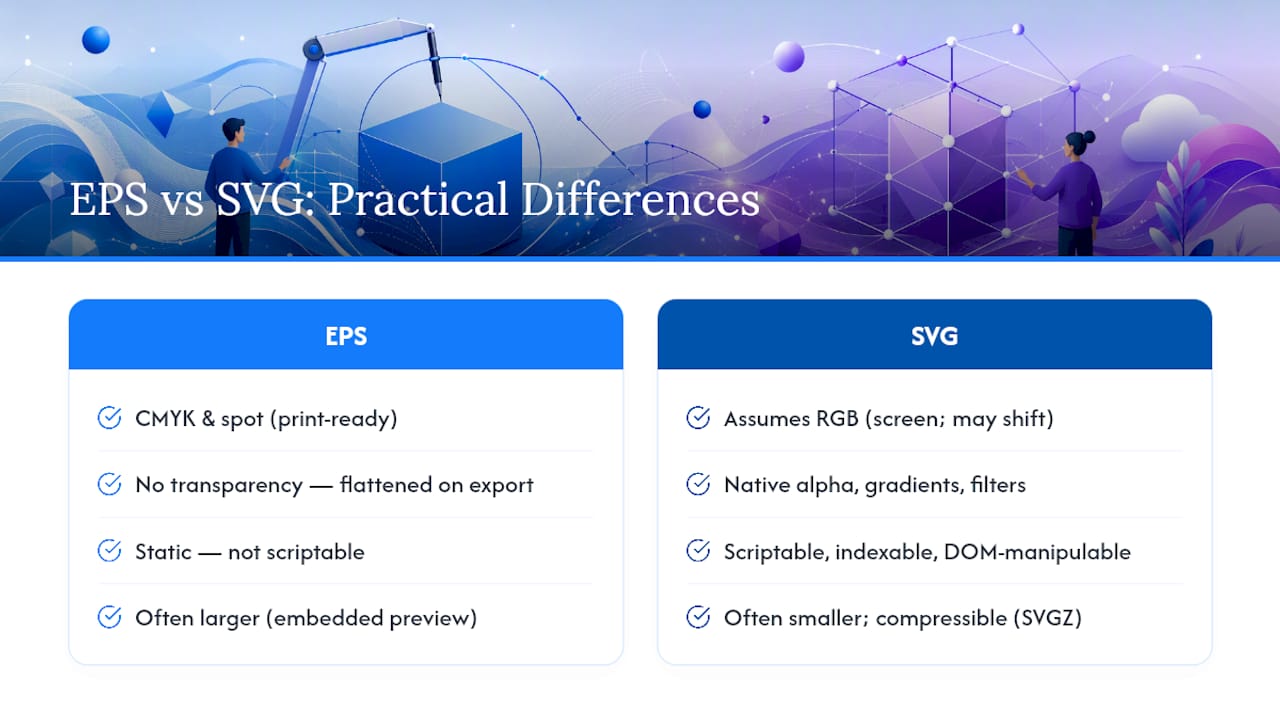
Color model. EPS and PDF support CMYK and spot colors directly, which is why a press operator asks for one instead of an RGB file. SVG assumes RGB and screen output, so color built for SVG can shift when it hits a printing plate.
Transparency and effects. SVG handles native alpha transparency, gradients, and filters without extra steps. EPS has no transparency model, so anything translucent gets flattened before export, which can bake unwanted color shifts into overlapping shapes.
Interactivity. SVG is scriptable and indexable, and a browser can manipulate it through developer tools the same way it manipulates any DOM element. EPS is static; nothing about it changes once it’s placed.
File size and performance. A simple logo as SVG is often a fraction of the size of the same logo as EPS with an embedded preview. That gap widens with SVGZ compression, per the W3C’s own specification.
Editability. SVG is text you can open in a code editor and hand edit if needed. EPS is PostScript program code, which is technically editable but not something a designer touches by hand.
Compatibility. Browsers, design apps, and dev tools all read SVG. Print RIPs and older prepress software expect EPS or PDF, and some office applications still flag EPS imports for security reasons.
Many print shops request EPS not because it’s technically superior, but because their RIP hasn’t been updated, and what the receiver can accept often decides the format, not what’s objectively newer.
How to Pick the Right Format for the Job in Front of You
Run through this before you export anything:
- Identify the destination. Website, app, social icon, or a press?
- Check the color requirement. If a printer specifies Pantone or CMYK separations, that rules out SVG.
- Ask about transparency. Web work with overlays and effects favors SVG; flattened print art works fine as EPS or PDF.
- Confirm the receiving software. A developer wants SVG they can drop into code. A press operator wants a file their RIP already understands.
- For cutting machines like Cricut, check the software’s supported formats directly. Most craft cutters import SVG well, but simplifying paths and reducing node count before export avoids jagged cuts on detailed artwork.
Pro Tip: When a printer’s spec sheet is vague, ask for their preferred file type by name rather than guessing. It saves a reprint and it saves you the awkward call explaining why the colors came out wrong.
For logos and UI elements, export SVG for e-commerce websites and product pages. For large-format print and anything requiring exact spot colors, ask for PDF first and fall back to EPS only if that’s specifically requested. Our guide on print file best practices for custom clothing brands covers the print side in more depth.
Converting Between EPS and SVG Without Breaking Your Artwork
Conversion is possible in both directions, but it’s rarely a clean, one-click swap. Complex PostScript features, embedded raster images, and transparency effects can mistranslate, leaving you with distorted paths or missing fills that need manual cleanup in Illustrator or Inkscape.
What typically breaks:
- Embedded rasters that don’t carry over cleanly and need re-linking or re-embedding
- Flattened transparencies that lose their original layering
- Fonts that reflow or substitute if they weren’t outlined first
- Clipping masks that clip the wrong shape after the format switch
- Overly complex paths that balloon file size or slow rendering
Before you hand off a converted file, run through this: confirm the color profile matches the destination, outline all text, check the viewBox against your intended trim and bleed, and render a test proof at full size. That last step catches more errors than any of the others combined.
Which Software Actually Handles Each Format Well
Adobe Illustrator remains the most complete tool for both formats, exporting clean SVG for web and EPS or PDF for print without much fuss. Inkscape is a strong free alternative, particularly for SVG cleanup, and Affinity Designer handles both reasonably well for designers who want an Adobe alternative.
For web handoff, developers usually want SVG either inclined directly in HTML or referenced as an external file, then tested in browser dev tools before it ships. The safest habit: keep a native AI working file as your master copy, and export SVG or PDF/EPS only as final deliverables for their specific destination.
Export Settings That Save You a Reprint or a Broken Page
For web, minify the SVG, strip unnecessary metadata, and set a proper viewBox so it scales cleanly across screen sizes; gzip it as SVGZ where your platform supports it.
For print, hand over a PDF whenever possible instead of raw EPS. Embed your CMYK or spot color specs, include bleed and trim marks, and outline every font so nothing reflows on someone else’s machine.
For apparel specifically, always confirm the printer’s preferred file type before you export anything:
- Outlined vector artwork avoids font substitution issues entirely
- Approved PDF or EPS with clear color notes (Pantone numbers, not just visual swatches) prevents guesswork on press
- Our custom logo apparel brand standards guide breaks down logo file requirements specific to garment printing
Pro Tip: If you’re not sure whether a printer wants EPS or PDF, send PDF. It’s increasingly the preferred handoff format industry-wide and it avoids most of EPS’s compatibility headaches.
What Tekton LA Asks Clients to Upload, and Why
We ask clients for a native vector file plus a PDF whenever possible. EPS is fine when a specific press process calls for it, but PDF gives us the same CMYK accuracy with fewer compatibility surprises on our end.
The three mistakes we see most: fonts that weren’t outlined before export, low-resolution rasters embedded inside an otherwise clean vector file, and missing color specs that leave us guessing on Pantone matches. Our upload checklist is simple: outline your fonts, build in bleed, and confirm spot colors before you send anything our way. Browse Tekton LA to see the print and branding services these files feed into, from screen printing to embroidery.
Why Designers Overthink This More Than They Should
The EPS versus SVG debate gets treated like a religious argument when it’s really a routing problem. Nobody agonizes over whether to use a hammer or a wrench. You look at the job and pick the tool built for it.
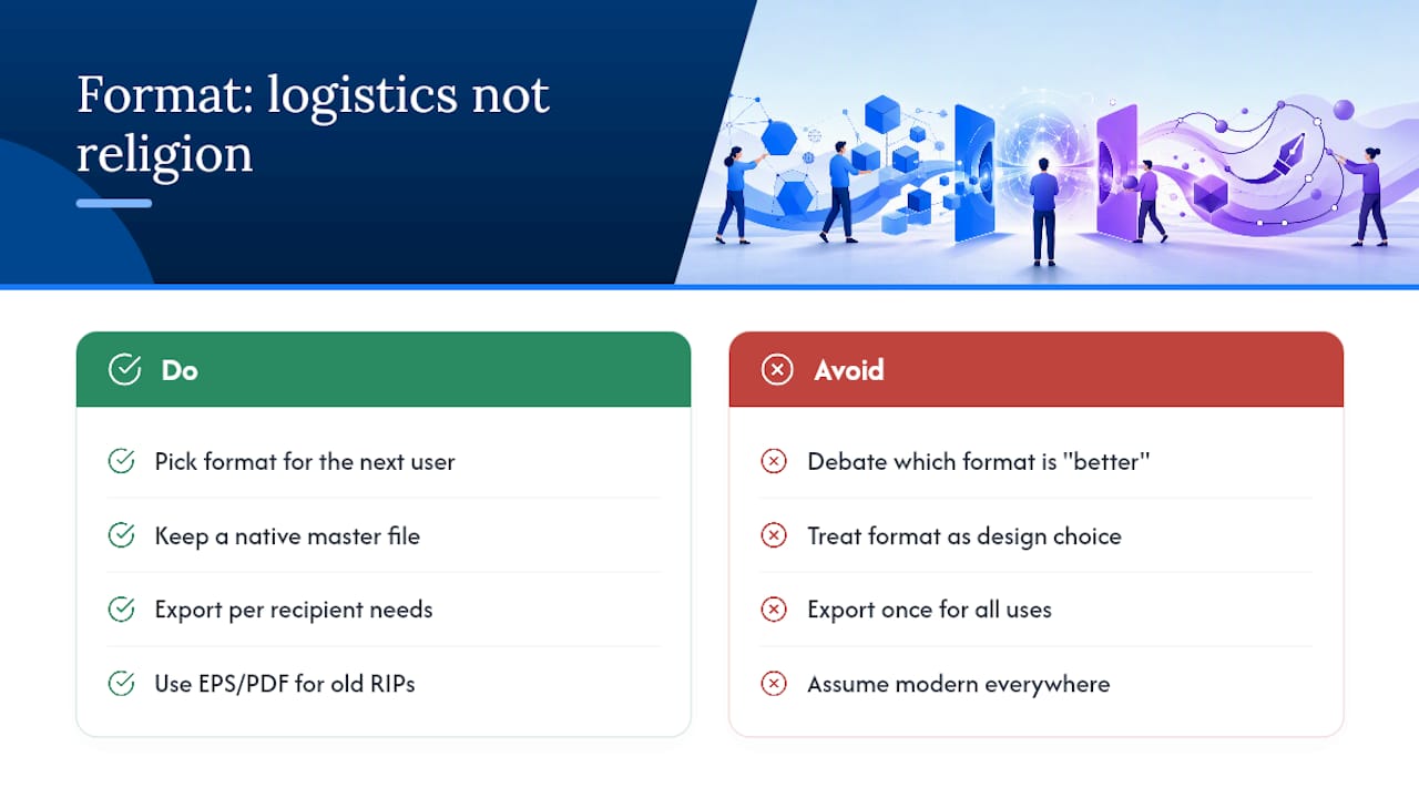
What I think gets missed most often: designers treat file format as a design decision when it’s actually a logistics decision. The artwork doesn’t change. The color palette doesn’t change. What changes is who receives the file and what their equipment expects. A designer obsessing over “which format is better” is asking the wrong question. The right question is “what does the next person in this chain need from me to do their job without calling me back.”
That reframe also explains why EPS refuses to die despite SVG being objectively more flexible for almost everything else. It’s not nostalgia. It’s that a fifteen-year-old RIP sitting in a print shop’s back room doesn’t care how modern SVG is. It cares whether the file it receives matches the language it already speaks. Until every press operator upgrades their hardware, EPS and PDF stay relevant for one reason only: backward compatibility pays the bills more reliably than being cutting-edge.
If there’s a real mistake designers make, it’s exporting once and hoping it works everywhere. The smarter habit is keeping a native master file and treating every export, SVG, PDF, or EPS, as a translation built for one specific reader.
— Christian
Sources
- EPS vs. SVG: What are the differences? | Adobe
- Scalable Vector Graphics (SVG) — W3C
- EPS format: history, how it works, and pros/cons | Cloudinary
- SVG - MDN Web Docs