

Simulated process printing reconstructs a full-color photo using halftones of opaque plastisol inks over a tonal underbase, so it prints true color on black and dark garments where CMYK falls apart. Choose it when the artwork has gradients or photo-real detail and you can run roughly 24 or more pieces to absorb the separation and setup cost. For anything with fewer colors, a lighter shirt, or a run under a dozen pieces, spot color or DTG usually gets you there faster and cheaper.
TL;DR:
- Simulated process printing requires at least 24 shirts to be cost-effective due to high setup and separation costs.
- Using 6 to 10 halftone ink screens over an underbase enables realistic gradients on dark garments, outperforming CMYK on black fabric.
- Proper file preparation involves high resolution, RGB color mode, flattened effects, and detailed separations into multiple tonal channels.
- Mesh selection and consistent registration are critical, with recommended mesh counts of 156 to 230 for halftone screens, and a mesh-to-line ratio of 4 to 5 times the halftone LPI.
- Problems typically stem from underbase opacity, registration drift, mesh tension, or incorrect exposure, which can be mitigated by thorough pre-press checks.
Table of Contents
- How Does Simulated Process Printing Actually Work?
- Simulated Process vs. CMYK vs. DTG vs. Spot Color: Which Fits Your Job?
- When Does Simulated Process Actually Pay Off?
- How Do You Prep Art for Simulated Process Printing?
- What Press Settings Get Simulated Process Printing Right?
- Why Do Simulated Process Prints Go Wrong?
- What Do Real Simulated Process Jobs Look Like?
- Where Did Simulated Process Printing Come From?
- How Does Simulated Process Compare to Other Hybrid Printing Methods?
- Is Simulated Process Printing Environmentally Sustainable?
- What Equipment Does a Simulated Process Job Actually Require?
- How Do Printers Fine-Tune Color Matching on Simulated Process Jobs?
- What Should You Ask Before Committing to a Sim Process Run?
- Ready to Print Your Photo-Real Design on Dark Garments?
- Sources
How Does Simulated Process Printing Actually Work?
Instead of blending four transparent CMYK inks, simulated process builds an image from six to ten opaque, spot-color-like inks printed as halftone dots over a tonal white underbase. The underbase and halftone layering is what lets the print reconstruct skin tones, shadows, and gradients on a black shirt without the muddiness that plagues transparent inks on dark fabric.
Screen count depends on artwork complexity. A simple headshot might separate into six channels; a detailed portrait with deep shadow work can push past ten. Fewer screens mean faster setup but flatter tonal range; more screens buy realism at the cost of registration risk and press time.
File prep starts long before separation:
- Work at 300 PPI at final print size, not a downscaled web image.
- Stay in RGB or a working color mode until the separator builds the actual print channels.
- Flatten effects (drop shadows, blend modes) before handing off, so nothing shifts during separation.
- Use dedicated separation plug-ins or send files to a separation artist familiar with your shop’s ink set.
Simulated Process vs. CMYK vs. DTG vs. Spot Color: Which Fits Your Job?
The decision usually comes down to garment color, run size, and how much gradient detail the art actually has. CMYK process relies on translucent ink layered over the shirt itself to create color and highlights, which works fine on white cotton but turns gray and lifeless on dark fabric because there’s no light garment underneath to bounce through the ink. Simulated process solves that with opaque ink over an underbase, which is also why shops report it consistently outperforming CMYK on dark garments for photo-real work.
Here’s how the four methods stack up on the axes that actually matter for a buying decision:
- Garment color suitability: Simulated process and DTG both handle dark garments well; CMYK is limited to white or very light shirts; spot color works on any color as long as the design uses flat, defined shapes.
- Screen count / complexity: Spot color runs 1 to 4 screens; simulated process runs 6 to 10; CMYK uses 4 fixed screens; DTG uses no screens at all.
- Durability and hand: Plastisol-based methods (simulated process, spot color) print thicker but hold up to repeated washing; DTG inks sit lighter on the fabric but can fade faster with abrasion.
- Setup time and minimum run: DTG has near-zero setup and works for single pieces; simulated process needs real separation work and rewards runs of two dozen or more; spot color sits in between.
- Cost per unit at volume: DTG costs stay flat regardless of quantity; simulated process costs drop sharply as run size climbs past the break-even point.
If the art is a photo and the shirt is black, simulated process wins. If it’s a one-off gift order, DTG saves money on small runs below around two dozen pieces. If the design is two or three flat colors, spot color is simpler and cheaper every time.
When Does Simulated Process Actually Pay Off?
Run size is the whole economic story here. Separation work, screen burning, and press setup are fixed costs that don’t care whether you’re printing 12 shirts or 200, so the per-unit cost only makes sense once you spread that fixed cost across enough pieces. Industry practice generally puts the break-even point around 24 to 36 shirts, below which DTG or a simpler spot-color approach typically wins on cost.
A few practical guidelines for budgeting the job:
- Expect a real art fee. Professional separations for a 6 to 10 color photo-real design take hours of skilled work, separate from the print charge itself.
- Reuse separations when you can. A design you’ll reorder across seasons amortizes that art fee every time you reprint it, which is where sim process quietly gets cheaper over time.
- Match the use case to the method. Portraits, gradient-heavy streetwear graphics, and retail drops on black or navy tees are the textbook fit; flat logos are not.
- Account for fabric. Heavier cotton holds ink laydown better than blends; textured or ring-spun fabrics can soften fine dot detail, which matters more on a photo-real print than a bold logo.
How Do You Prep Art for Simulated Process Printing?
Good separations decide more than half the outcome before a screen ever hits the press. Separation quality, mesh selection, and exposure discipline are consistently cited as the biggest determinants of whether a sim process print looks photo-real or looks muddy.
Start with the file itself:
- Build or supply artwork at 300 PPI at true print size.
- Keep the file in a flexible color mode until separation, since flattening to CMYK too early throws away tonal information a separator needs.
- Flatten every layer effect and blend mode before separation, and proof at 100% zoom to catch banding or noise the separator will amplify.
The separation itself usually breaks into three parts: a tonal underbase (never a flat solid white, since a solid underbase washes out shadow depth), selective highlight white where the brightest points in the image need extra punch, and a channel palette of four to eight colors chosen to match the art’s dominant tones rather than a generic CMYK set.
If you’re outsourcing separations, hand the separator the final print size, the exact garment color, your mesh counts, and a sample of past work from your press so the halftone build matches what your equipment can actually reproduce.
Pro Tip: Ask your separator for a proof with a simulated dot-gain overlay before you burn screens. It’s the cheapest insurance against a $200 reshoot.
What Press Settings Get Simulated Process Printing Right?
Mesh selection is where a lot of otherwise good separations fall apart on press. Monarch Color recommends 156 to 230 mesh for color halftone screens and 110 to 156 mesh for the underbase, with tension kept consistent across every screen in the set so registration doesn’t drift mid-run.
Print order matters as much as mesh: underbase first, flash-cured, then color screens working from darkest to lightest, then highlight white last if the design calls for it. Off-contact distance should stay tight and consistent screen to screen, since even small variation causes dot distortion on fine halftones.
Key checks before a full run:
- Flash cure the underbase fully before laying color, and confirm cure at roughly 280 to 320°F with a stretch test.
- Pull a test print and check dot integrity with a loupe.
- Verify registration tolerance is holding across all screens, not just the first few.
- Decide manual versus automatic press based on screen count. An 8 to 10 screen job on a manual press multiplies operator error with every pass.
One number worth remembering: mesh should run at least 4 to 5 times the halftone’s lines-per-inch, a ratio that protects fine gradient detail from turning into visible dot patterns.
Why Do Simulated Process Prints Go Wrong?
Most problems trace back to one of four things: underbase density, registration, mesh tension, or cure time. Muddy colors usually mean the underbase didn’t lay down opaque enough to block the garment color underneath. Dot bridging, where halftone dots merge into a solid blob, points to over-exposed screens or ink that’s too thin for the mesh count. Moiré patterns show up when mesh and halftone LPI aren’t matched correctly. Chalky, dull highlights are almost always an underbase or highlight white printed too thin.
Work through these in order before touching a screen:
- Check underbase opacity and cure first, since it affects every layer printed on top.
- Confirm registration is holding, not just at screen one but at screen eight.
- Inspect mesh tension for sag, which distorts dot shape gradually over a run.
- Recheck exposure times against a step wedge if dot integrity looks soft.
If none of that fixes it, the separation itself is the problem, and that means going back to the file, not the press.
What Do Real Simulated Process Jobs Look Like?
A 6-color portrait on a black hoodie typically separates into a tonal underbase, a highlight white, and four to five color channels running 156 to 230 mesh, producing visible skin tone gradation without a flat, poster-like look. A gradient-heavy streetwear graphic with sunset colors or smoke effects often needs eight or more screens and benefits from stochastic halftones to avoid banding across smooth color transitions.
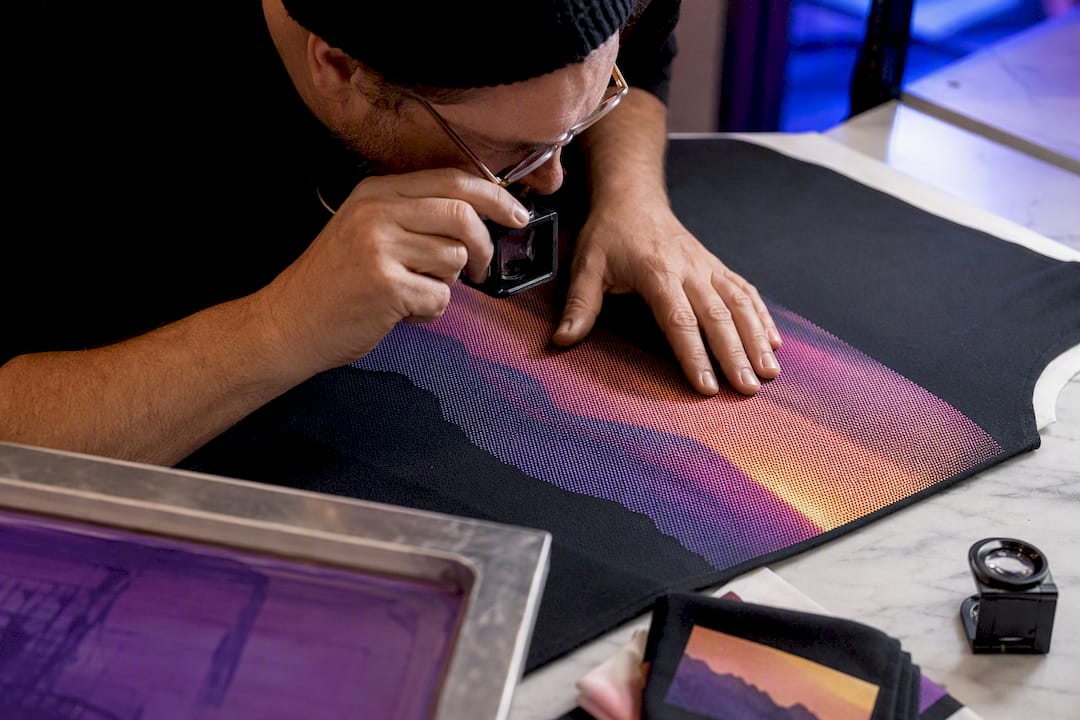
On any proof, check three things before approving the run: does the underbase fully block the garment color, do highlights read as bright rather than gray, and does the gradient transition smoothly under a loupe rather than in visible bands.
Where Did Simulated Process Printing Come From?
Simulated process grew out of a real limitation in traditional four-color process printing on textiles. CMYK worked fine in commercial paper printing, where the substrate is always white and ink transparency is an asset. Screen printers who tried to port that same four-screen CMYK approach onto colored and dark garments in the 1980s and 1990s ran into the same wall every time: transparent ink over a black or navy shirt just produces gray, not color.
Shops began experimenting with opaque, spot-color inks layered as halftones instead of relying on garment color to complete the image. Early versions were rough, often limited to four or five screens and fairly flat-looking results, because separation software and exposure equipment hadn’t caught up to what the technique demanded. The real leap came with better halftone control, computer-to-screen imaging that replaced hand-cut film positives, and separation software built specifically for garment printing rather than adapted from offset printing workflows.
By the 2000s, sim process had become a recognized specialty within the screen printing trade, distinct enough from both standard spot color and CMYK process to earn its own name and its own body of shop-floor technique. Mesh counts climbed, underbase strategy became a discipline of its own, and separation artists began specializing specifically in photo-real garment work. The method today owes more to accumulated shop-floor trial and error, documented through trade publications and printer forums, than to any single invention or patent.
How Does Simulated Process Compare to Other Hybrid Printing Methods?
Simulated process sits in a category of hybrid techniques that all try to solve the same underlying problem: how to get more color range and photo realism out of processes that were originally built for flat, limited color. It’s useful to see where it overlaps with, and differs from, its closest cousins.
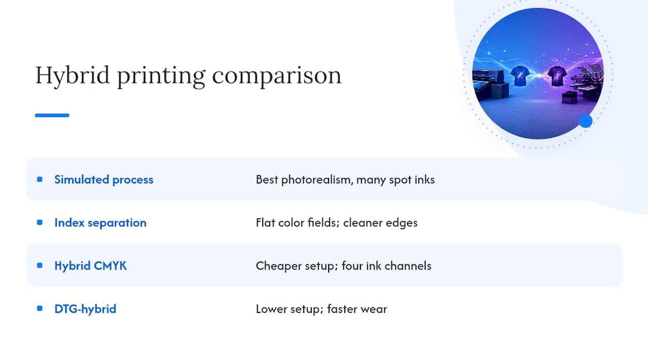
Index separation is probably the nearest relative. Like simulated process, it uses multiple spot-color screens rather than transparent CMYK, but it builds the image from flat color fields rather than halftone dots, which gives cleaner edges on illustration-style art but less photographic gradation than sim process delivers.
Hybrid CMYK, sometimes called “CMYK plus,” adds an opaque white or underbase layer to standard four-color process to extend it onto darker garments. It’s a middle ground: cheaper to separate than full simulated process because it keeps the four-screen CMYK structure, but it can’t match sim process’s color depth or shadow detail because it’s still working with only four ink channels instead of six to ten.
DTG-hybrid workflows, where a shop prints a screen-printed underbase then finishes detail with direct-to-garment ink, split the difference on setup time and cost. They can approach sim process quality on small runs where full screen separation isn’t economical, but the DTG layer typically wears faster than an all-plastisol build.
None of these fully replace simulated process where the job calls for genuine photo realism on a dark garment at real production volume. Each hybrid trades some of sim process’s depth for less setup time, which is exactly the trade-off worth weighing against your own run size and budget.
Is Simulated Process Printing Environmentally Sustainable?
Plastisol-based simulated process printing carries a heavier environmental footprint than digital methods on a per-piece basis, mainly because of screen reclamation chemicals, water use in cleanup, and the cure ovens running at 280 to 320°F for extended periods across a multi-screen job. More screens mean more emulsion, more reclaim solvent, and more energy spent curing each pass.
The offsetting factor is durability and run efficiency. A well-cured plastisol print on quality cotton holds up to years of washing, which spreads the environmental cost of production across a longer garment lifespan than a print that fades or cracks after a season. Because the method only makes financial sense at higher run sizes, the fixed environmental cost of screen setup and cure also gets divided across more units, unlike single-piece digital printing where each item carries its own full share of resource use.
Shops looking to reduce impact typically focus on a few concrete levers: water-based or eco-plastisol ink formulations instead of standard PVC-based plastisol, screen reclaim systems that filter and reuse water rather than sending it straight to drain, and sourcing blanks made from organic or recycled cotton so the garment underneath the print carries less environmental weight of its own. None of these change the core mechanics of simulated process, but they meaningfully change its footprint per finished shirt.
What Equipment Does a Simulated Process Job Actually Require?
A simulated process job runs through more hardware than a simple one-color print, and each piece has a real effect on final quality. The exposure unit is where separations become physical screens, and consistency there, meaning even light distribution and accurate exposure timing, determines whether fine halftone dots hold their shape or blow out.
Screens themselves need consistent, properly tensioned mesh across every screen in the set, since even minor tension variance between an underbase screen and a color screen shifts registration over a long run. Flash cure units sit between print stations to partially cure the underbase before color goes down, and their temperature consistency matters more on multi-screen jobs than on a simple one or two-color print, where a single flash pass covers the whole design.
The press itself can be manual or automatic. A manual press works fine for shorter runs and lower screen counts, but an 8 to 10 screen simulated process job on a manual press multiplies the chance of operator-introduced registration drift with every pass a printer has to align by hand. Automatic presses hold registration mechanically across dozens or hundreds of pieces, which is why most shops move sim process work to automatic equipment once screen count and run size both climb.
Final cure ovens or tunnel dryers finish the job, and dwell time and belt speed both need tuning to the specific ink and fabric combination rather than a single house setting, since heavier fabric blends absorb heat differently than lightweight cotton.
How Do Printers Fine-Tune Color Matching on Simulated Process Jobs?
Getting colors to actually match a client’s brand palette, rather than just looking good in the abstract, takes more than picking pleasing inks. Experienced separators build a channel palette specifically around the dominant tones in the artwork rather than defaulting to a generic six-color set, which is why two shops separating the same file can produce noticeably different results.
Mesh-to-LPI matching is the single most reliable lever for color accuracy on fine gradients. Running mesh at least four to five times the halftone’s lines-per-inch keeps dots crisp enough to hold their intended color value instead of blending into neighboring dots and shifting the perceived hue.
Exposure step-wedge testing catches a problem most shops don’t think to check until a run is already ruined: screens that are slightly over or under-exposed still look fine to the naked eye but shift dot size just enough to throw off color balance across a six to ten screen stack. A jeweler’s loupe check on test pulls catches dot integrity issues before a full run commits ink to fifty shirts.
Stochastic and elliptical halftone patterns, run at high dpi film output, suppress the moiré interference that shows up when regular round dots overlap across multiple screens at slightly different angles. This matters most on smooth gradients like skin tones or sky transitions, where any visible pattern breaks the photo-real illusion the whole technique is built around. Shops chasing the tightest color accuracy also lean on the tonal underbase itself as a color tool, since a slightly warm or cool underbase shifts every color printed on top of it.
What Should You Ask Before Committing to a Sim Process Run?
Before quoting or printing a job, Tekton LA works through file resolution and color mode, garment color and fabric type, target run size, and how many proof rounds the client expects. Talk to your print partner early in the design phase, not after the art is finalized. Catching a resolution or color issue before separation saves real money.
Ready to Print Your Photo-Real Design on Dark Garments?
Most shops quote simulated process by the screen, which punishes exactly the kind of detailed, gradient-heavy artwork this technique exists for. Pricing is offered around the finished piece, so more complex separations do not necessarily mean a bigger markup.
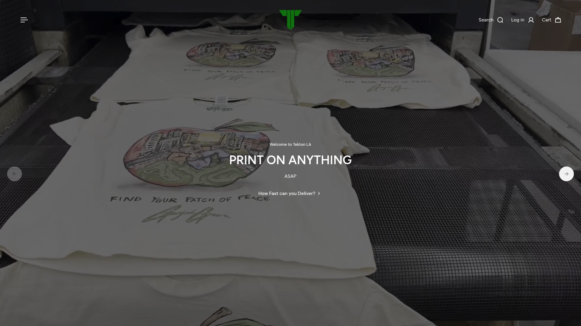
Getting a quote is straightforward: send over your print size, garment color, target run quantity, and the actual art file, and the print provider will advise whether simulated process is the right call or if a simpler method saves money on your specific job. If your artwork leans on dark fabric and fine tonal detail, the printers shirt line shows what a properly separated, well-cured print actually looks like at production scale. Shops weighing garment finish alongside print technique can also look at Tekton LA’s garment dye options, which pair well with photo-real graphics on a softer, pre-washed base fabric. No minimum order requirement on blanks means designs can be tested at a small scale before committing to the larger run size that makes simulated process pay off. Reach out through Tekton LA with your file and run size, and get a straight answer on cost and timeline before you commit to separations.
Sources
- Simulated Process Color Screen Printing: How to Print Photorealistic Designs — Printable Press
- How To Screen Print | Photo Screen Printing | Bella+Canvas blog
- Simulated Process Screen Printing Tips — Monarch Color Corp
- Spot Color to Simulated Process: A Screen Printer’s Guide | Halftone Cat