

Short-sleeve prints belong centered on the outer sleeve panel, roughly 1 to 2 inches above the hem, sized 2.5 to 4 inches wide and 1 to 4 inches tall. Long-sleeve prints run vertically, typically starting a few inches above the cuff, with widths generally ranging between 2 and 3.5 inches and lengths up to about a foot. Both need a clearance buffer from seams and ribbing, and the printing method you choose changes how tight you can run those margins.
- Short sleeve: center on outer panel, approximately an inch or two above hem; about 2.5 to 4 inches wide and 1 to 4 inches tall; maintain minimum clearance from seams
- Long sleeve: vertical run starting several inches above cuff; width roughly 2 to 3.5 inches, length can be up to about a foot; keep a buffer from seams
Pro Tip: Screen printing and embroidery need more breathing room near seams than DTG or DTF, because ink deposit and stitch density both react badly to fabric that’s already under tension from a seam.
Key Takeaways
Sleeve print placement succeeds when numeric clearances, stable-landmark measuring, and method-specific artwork setup are locked in before a single unit hits the press.
| Point | Details |
|---|---|
| Short-sleeve specs | Center on outer panel, 1–2 in above hem, sized 2.5–4 in wide. |
| Long-sleeve specs | Start vertical runs ~3.5 in above cuff, 2–3.5 in wide, up to 14 in long. |
| Seam clearance | Keep 1 in minimum on short sleeves, 2–3 in buffer on long-sleeve runs. |
| Method changes the margin | Screen print and embroidery need wider clearances than DTG/DTF near seams. |
| Tekton LA verifies before full runs | Tekton LA checks file setup, sample press, and cuff/seam behavior before production. |
Table of Contents
- What are the main sleeve print placement styles?
- How do you measure sleeve print size and placement?
- What file specs do sleeve prints need before production?
- How does the printing method affect sleeve placement?
- How do you measure and align sleeve prints for a production run?
- Why do sleeve prints distort, and how do you fix it?
- How does Tekton LA handle sleeve print production and QC?
- The most important thing to get right first
- Get Sleeve Prints Production-Ready With Tekton LA
- Frequently Asked Questions
- Sources
What are the main sleeve print placement styles?
Four placements cover almost every sleeve job you’ll get: shoulder hits, centered outer-sleeve graphics, cuff/hem prints, and full-length vertical runs. Each one serves a different design goal, and picking the wrong one for the brief is the most common reason a reprint gets requested.
- Shoulder placement: small badges, team crests, or sponsor logos that need to read from a distance
- Centered outer sleeve: the workhorse placement for brand marks, streetwear graphics, and repeating patterns
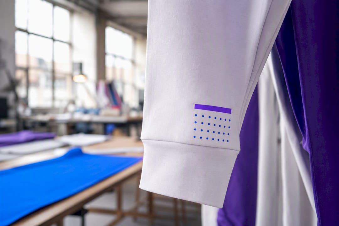
- Cuff/hem hit: subtle branding, a single word, or a small icon meant to be discovered rather than announced
- Wrist-to-elbow or full-length vertical: statement graphics, typography runs, or wraparound artwork on long-sleeve garments
Sleeve taper matters more than most designers assume. A sleeve narrows toward the wrist, so artwork that looks straight on a flat mockup can appear to lean or bow once the garment is worn. Centered outer-sleeve placement handles taper the most forgivingly because the design sits on the widest, flattest part of the arm. Full-length vertical runs demand more care. Gildan’s decorator guidance notes that long sleeves reward designers who preview artwork on the actual garment rather than a flat template, since taper and seam bulk both distort how a vertical line reads once someone’s arm bends.
Cuff hits work best when the message is secondary. A sponsor name at the wrist reads as a detail; the same name blown up to fill the sleeve reads as the main event.
How do you measure sleeve print size and placement?
Job tickets need numbers, not descriptions like “small logo near the hem.” Here’s what to write down.
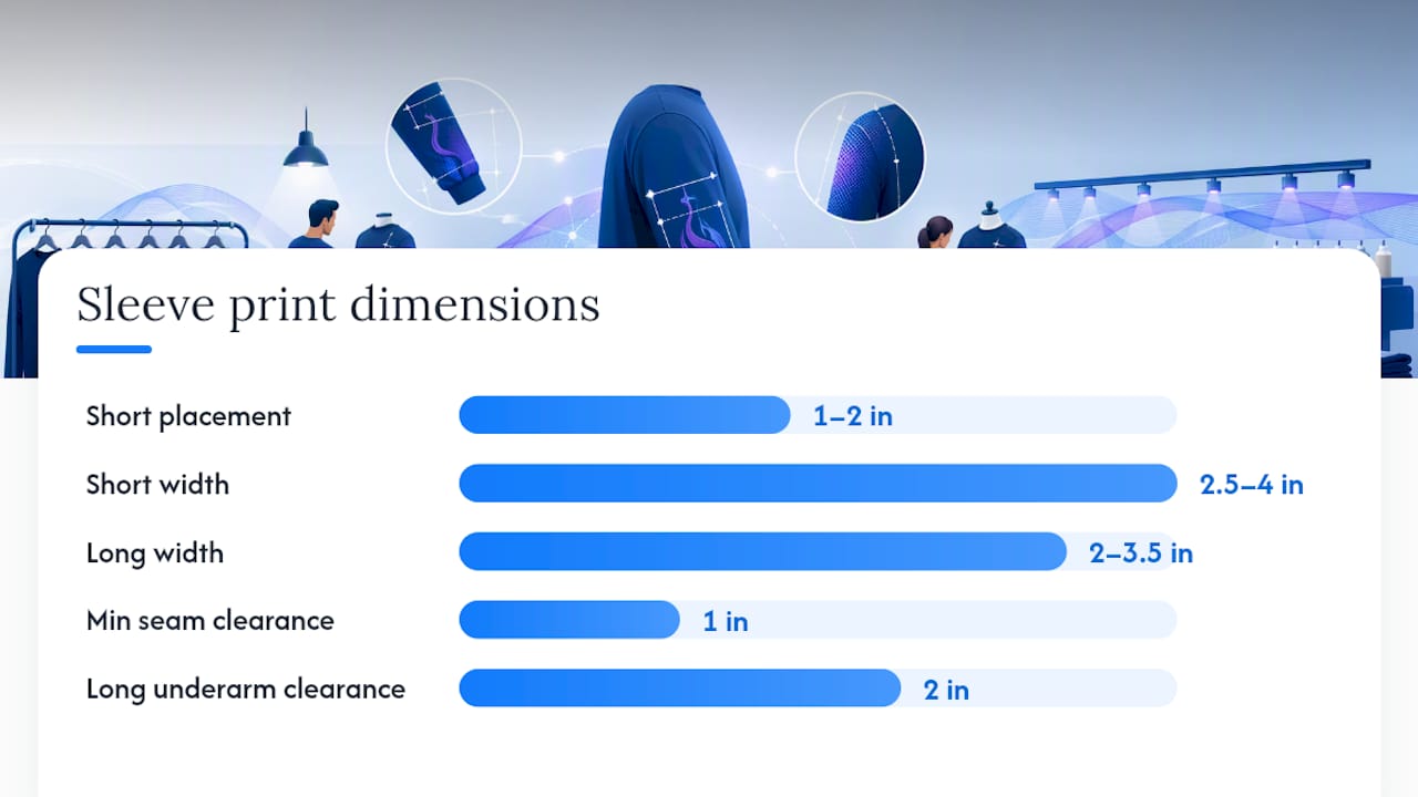
- Short-sleeve placement: about an inch or two above the hem, centered on the outer panel
- Short-sleeve width: generally between 2.5 and 4 inches, smaller widths for detailed logos
- Long-sleeve start point: a few inches above the cuff
- Long-sleeve width: roughly 2 to 3.5 inches, narrow to avoid wrapping around seams
- Long-sleeve length: varies, typically less than a foot depending on design needs
These figures come from Screenprinting, and they hold up as a solid default across most adult unisex cuts.
Scaling changes the math, though. Youth garments have shorter sleeves and less flat panel to work with, so you’ll often need to shave 0.5 to 1 inch off both width and the hem distance to keep the design from crowding the seam. Women’s cuts frequently run narrower through the sleeve, which pushes you toward the low end of every width range above. Oversized and boxy garments give you more room, but resist the urge to fill it. A print that’s technically small on an oversized sleeve panel usually still reads correctly because the panel itself is larger; scaling art up to “fill the space” often pushes it too close to the seam. Whatever the garment, hold that 1-inch minimum clearance from any seam and never let a long-sleeve run get closer than 2 inches to the underarm seam.
What file specs do sleeve prints need before production?
Artwork that isn’t set up correctly is the single biggest cause of reprints on sleeve jobs, mostly because the print area is small and unforgiving of resolution problems that would go unnoticed on a chest print.
- Choose the right file type. Vector EPS or PDF for solid colors and text, 300+ DPI PNG or TIFF for photographic or gradient artwork, with transparent backgrounds whenever the design sits on a colored garment.
- Build to the correct canvas size. Use a 3 x 3 inch canvas at 300 DPI for short-sleeve hits, and a 2.5 x 14 inch canvas at 300 DPI for long-sleeve verticals, per the template dimensions TransferExpress uses in production.
- Add safety margin. Build in 0.125 to 0.25 inch of bleed or clearance inside the canvas so nothing critical sits at the trim edge.
- Mark registration. Include a center crosshair or registration marker so the press operator can align the design without guessing.
- Flatten a mockup. Show the art placed on an actual garment template, not just floating on a blank canvas.
- Name the file clearly. Tag it with the placement (e.g., “LS_LeftSleeve_Vertical_14in”) so nobody on the floor has to open the file to know where it goes.
Pro Tip: A flattened mockup catches more placement errors before press time than any spec sheet, because it forces you to see the design sitting on sleeve taper instead of a flat rectangle.
How does the printing method affect sleeve placement?
The decoration method you pick determines how close to a seam you can safely print and how much fine detail survives.
- Screen printing handles bold solid colors well but struggles with very fine hairlines or tiny text; give it slightly larger minimum sizes and keep it off heavily ribbed cuffs.
- DTG and DTF render photographic detail and gradients cleanly, which makes them strong for full-color sleeve graphics, but edge bleed becomes a real risk near ribbing or seams where the substrate isn’t perfectly flat.
- Embroidery needs simplified shapes and a minimum stitchable size, usually no finer than small lettering allows, plus extra clearance from seams so the hoop doesn’t catch fabric bulk.
- Heat transfer allows precise, repeatable placement, but a thick transfer near the cuff can create a stiff hand-feel that some wearers notice immediately.
Gildan’s decorator notes also flag ink choice as part of this equation: plastisol suits heavier fabrics, water-based inks keep a softer hand on ring-spun cotton, and discharge printing works best on 100% cotton blanks. If you’re deciding between methods for a streetwear-style sleeve graphic, screen printing tends to win on bold color and cost at volume.
How do you measure and align sleeve prints for a production run?
Consistency across a run comes down to using stable landmarks and the right tools every single time, not eyeballing each garment individually.
- Gather your tools. Tailor’s chalk, heat-resistant tape, a ruler, placement templates, and a smaller specialty sleeve platen for tight surfaces.
- Measure from stable landmarks. VistaPrint’s placement guidance recommends working from the collar, shoulder seam, or hem, never from a stretchy or shifting point on the garment.
- Short-sleeve workflow: measure up from the hem, mark the horizontal center, load onto a small sleeve platen, and pull one verified sample before running the batch.
- Long-sleeve workflow: mark both the start and end points relative to the cuff, use alignment tape to stop the fabric from twisting under the platen, and test the layout on at least two garment sizes.
- Log it and check it. Record every measurement on the job ticket, then run a short sample batch before committing to full production.
Pro Tip: A smaller specialty platen isn’t optional for sleeve work. It gives you the pressure control a standard platen can’t, which is why decorators switch platens specifically for tight sleeve surfaces.
Why do sleeve prints distort, and how do you fix it?
Distortion almost always traces back to one thing: the design sat too close to a seam or ribbed panel that moves or stretches differently than the flat fabric around it. Ribbing especially pulls unevenly under heat and pressure.
- Keep a minimum 1-inch clearance on short sleeves and 2 to 3 inches on long-sleeve runs, full stop.
- If alignment drifts across a multi-color or multi-station run, check the platen first. It’s the most common source of registration creep.
- Reduce artwork width before you reduce clearance. A narrower design almost always fixes wrap-around distortion faster than repositioning does.
- If ink coverage looks heavy near a seam, switching methods, say from a thick heat transfer to screen print, often solves the hand-feel problem outright.
Pro Tip: When a design keeps drifting between sizes in the same run, it’s rarely the artwork. It’s almost always the platen shifting slightly between garments of different sleeve circumference.
How does Tekton LA handle sleeve print production and QC?
Every sleeve job that comes through Tekton LA’s Downtown Los Angeles shop gets checked against a short list before it goes to press. Vector files for solid artwork, 300 DPI rasterized files for detailed work, a flattened mockup on the actual garment, and a filename that states the exact placement. Skipping any one of those is the fastest way to trigger a reprint, and catching it before press time is cheaper for everyone.
Ribbed cuffs and heavy seam bulk are the two things that wreck a sleeve print if nobody checks for them before the press comes down. A sample press and a measurement log against the job ticket catch both, every time.
Quality control runs through a sample press first, a written measurement log against the job ticket, and a specific check on how ribbed cuffs and seam thickness behave under pressure before the full run gets the green light.
- File formats accepted: vector EPS/PDF, 300+ DPI PNG/TIFF
- Named placement specs required on every job ticket
- Flattened garment mockup required before approval
- Sample press and measurement log before full production
Readers setting up their own files can cross-check specs against Tekton LA’s print file guidelines before submitting artwork.
The most important thing to get right first
Most sleeve print failures aren’t design failures. They’re measurement failures dressed up as design problems. A logo that looks great on a flat mockup and then twists or bows on the actual garment almost always traces back to someone skipping the seam clearance rule or eyeballing the hem distance instead of measuring it.
The conventional advice treats sleeve placement like chest placement with smaller numbers, and that’s where it falls short. Sleeve taper changes how artwork reads in a way chest placement never has to account for, and the seam and ribbing at the cuff behave nothing like flat fabric under a heat press. Ignore that distinction and you’ll spend more time reprinting than designing.
If you take one thing from this, prioritize the measuring workflow over the artwork itself. Get the landmarks, the clearances, and the sample-press check locked in first. The design can be adjusted in five minutes. A full batch of misaligned sleeves cannot.
Get Sleeve Prints Production-Ready With Tekton LA
Getting sleeve placement right on paper is one thing. Getting it right across a full production run, on ribbed cuffs, at different garment sizes, without a reprint, is where most in-house setups struggle. Tekton LA runs sleeve jobs through screen printing, DTG/DTF, and embroidery daily out of its Downtown Los Angeles shop, with no minimum order quantity on blanks, so you can test a sleeve placement on a handful of units before committing to hundreds.
That matters most for designers and brands who want to see a sample press before locking in a full batch. Order a printers shirt as a test garment, submit your file against the specs above, and get a real sample back instead of a flat mockup guess. If you’re ready to move a sleeve design into production, start your order with Tekton LA and get a shop-verified placement check before the full run goes to press.
Frequently Asked Questions
What is the standard sleeve print placement for a t-shirt? Center the design on the outer sleeve panel, about 1 to 2 inches above the hem, sized 2.5 to 4 inches wide depending on how detailed the logo is.
How far should a long sleeve print sit from the cuff? Start the design roughly 3.5 inches above the cuff, keeping the width between 2 and 3.5 inches so it doesn’t wrap into the seam.
Does printing method change sleeve print placement? Yes. Embroidery and screen printing both need wider seam clearances than DTG or DTF, since stitching and ink deposit react more to ribbing and fabric tension near a seam.
Why does my sleeve design look distorted when worn? It’s almost always placed too close to a seam or ribbed cuff, or the artwork is too wide for the sleeve’s taper. Reducing width or adding buffer space usually fixes it.
Sources
- Screenprinting
- Sizes and Placement For Screen Printed & Digital Transfers | TransferExpress
- T-Shirt Design Placement Guide | VistaPrint
- A Decorator’s Guide to Long Sleeve Printing: Placement, Sizing, and Ink Tips | Gildan