The role of team logo placement on apparel is the single most controllable factor in how your team’s brand registers with fans, sponsors, and officials. Where a logo sits on a jersey determines whether it reads as professional identity or afterthought. Sports administrators and marketing professionals who treat placement as a design decision, rather than a branding decision, consistently underperform on recognition and sponsor retention. This guide covers the primary placement zones, how printing methods constrain your options, what NCAA compliance requires, and how consistent logo positioning builds the kind of visual identity that sponsors pay to be part of.
What are the primary team logo placement locations and their impact?
Logo placement on team apparel follows a hierarchy of visibility, and each zone carries distinct trade-offs between size, legibility, and context.
Center chest is the highest-visibility position on any jersey or shirt. It faces forward during play, photographs well from a distance, and accommodates larger artwork without distortion. This position works best for primary team marks, wordmarks, or mascot graphics where maximum recognition is the goal. The trade-off is that center chest designs must compete with numbering on game jerseys, so coordination between logo scale and number placement is non-negotiable.
![]()
Left chest is the traditional placement for team logos on polo shirts, training tops, and warm-up gear. It sits close to the heart, which carries symbolic weight in team identity, and it aligns with how fans and sponsors expect to see a brand mark on professional apparel. The left chest standard positions the logo 7 to 9 inches down from the shoulder seam and 4 to 6 inches from the center placket. This precision matters because even a half-inch shift reads as sloppy when you line up a full roster.
Sleeves function as secondary branding real estate. They work well for sponsor marks, secondary team logos, or event-specific patches. Sleeve placement is especially effective on long-sleeve performance tops and hoodies, where the upper arm is visible during movement. The limitation is size. Logos on sleeves must be simplified to remain legible at smaller scales.
Back and upper back placements support larger-scale branding and are common on warm-up jackets and fan merchandise. The upper back, just below the collar, is the standard position for sponsor names on professional jerseys in leagues that permit it.
| Placement zone | Best use case | Visibility level | Size range |
|---|---|---|---|
| Center chest | Primary team mark, mascot | High | 8"–12" wide |
| Left chest | Team crest, sponsor mark | Medium, close-range | 3.5"–4.5" wide |
| Sleeve | Secondary logo, event patch | Medium, side-angle | 2"–3.5" wide |
| Upper back | Sponsor name, wordmark | High, rear-facing | 6"–10" wide |
The key insight here is that placement zones are not interchangeable. Moving a primary logo from center chest to left chest does not just change position. It changes the perceived hierarchy of the mark and how sponsors interpret their own logo’s prominence relative to yours.
How do printing methods and garment materials influence logo placement choices?
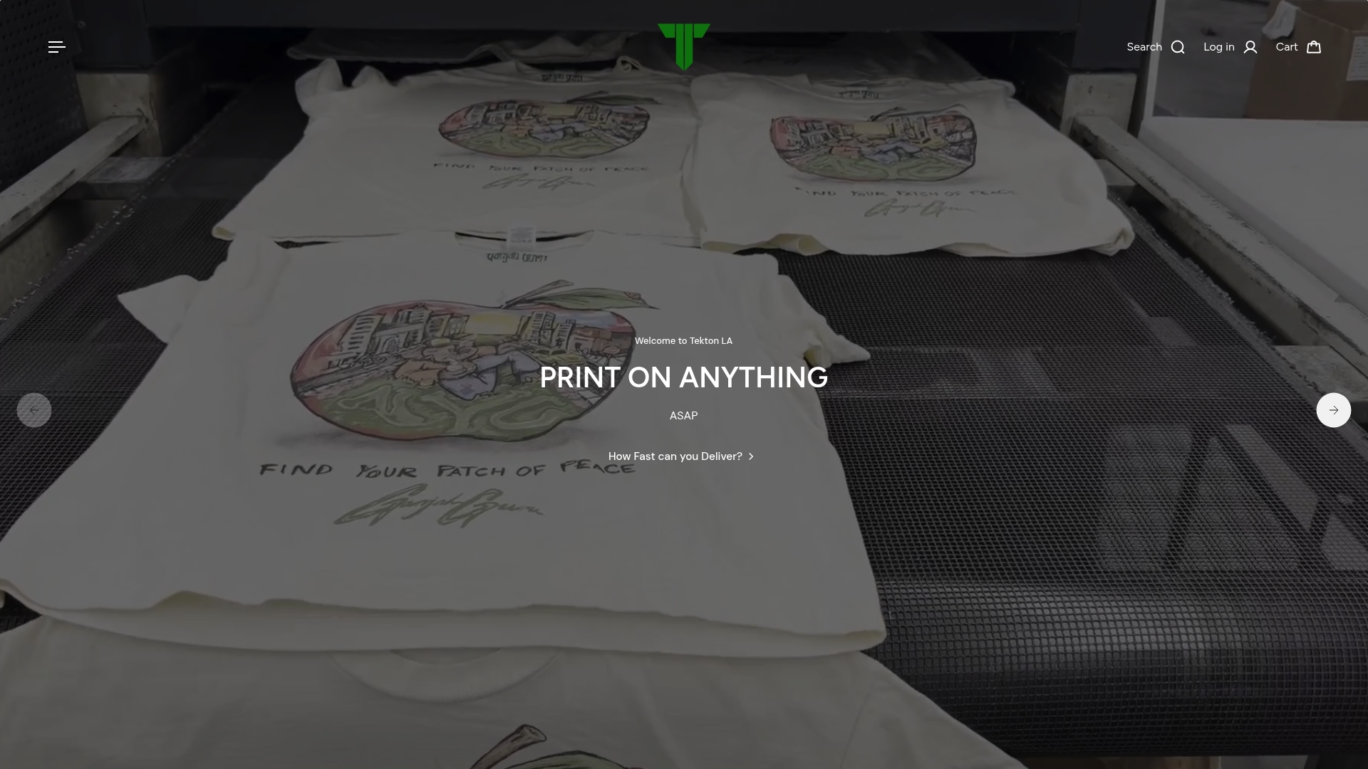
The printing method you choose does not just affect how a logo looks. It determines where on the garment a logo can realistically go, how large it can be, and how long it will hold up through a season of washing and wear.
![]()
Sublimation printing embeds artwork directly into fabric fibers, which means logos maintain durability without peeling or cracking over time. This method is ideal for full-chest or all-over designs on polyester performance jerseys. Because the ink becomes part of the fabric, sublimation works across large surface areas without adding weight or texture. The constraint is that sublimation only works on light-colored polyester or polyester-blend fabrics. Cotton garments and dark base colors are not compatible.
Embroidery is the gold standard for left chest placement on polos, coaches’ jackets, and training tops. The standard embroidery size for left chest logos runs 3.5 to 4.5 inches wide, and designs with fine detail or thin letterforms lose legibility at that scale. Logos intended for embroidery need to be simplified and professionally digitized before stitching. Overly complex artwork with gradients or thin lines will not translate cleanly into thread.
Screen printing and direct-to-garment (DTG) methods allow larger, more detailed logos across a wider range of placement positions. Screen printing excels on cotton and cotton-blend fabrics for center chest and full-back designs. DTG handles photographic complexity and works well for smaller production runs without the setup cost of screens. Both methods support the kind of multi-color, high-detail artwork that embroidery cannot reproduce at small sizes.
Garment material is the variable most teams overlook. Moisture-wicking polyester performs differently under sublimation than garment-dyed cotton performs under DTG. A logo that looks sharp on a performance jersey can appear washed out on a heavyweight cotton tee if the ink absorption rate is not accounted for during production. Always request a print test on the actual fabric before committing to a full run.
- Sublimation: polyester fabrics, full-chest or all-over designs, no peeling
- Embroidery: left chest on cotton or blended fabrics, 3.5"–4.5" max width, simplified artwork required
- Screen printing: center chest or back on cotton, multi-color capable, best for larger runs
- DTG: any position, complex artwork, smaller runs, cotton-preferred
Pro Tip: When ordering embroidered left chest logos, submit a vector file and request a stitch-count preview before production. This catches legibility problems before they become a 200-unit problem.
What league rules and sponsorship agreements affect logo placement on team apparel?
Regulatory constraints on logo placement are not optional considerations. For teams operating under NCAA governance, they are binding rules with real consequences for compliance.
The NCAA approved new uniform sponsorship rules in January 2025, effective August 1, 2025. Under these rules, commercial logos are restricted to a maximum 4 by 4 inch square on athletic uniforms. Schools may include up to two sponsor logos, but placement is tightly controlled to avoid interference with required uniform markings. This is not just a size rule. It forces design teams to adapt sponsor logos to fit within a strict spatial boundary while preserving legibility and brand integrity.
Teams must also avoid logo interference with required uniform elements such as player numbers, school identifiers, and manufacturer marks. A sponsor patch placed too close to a jersey number creates a compliance violation, regardless of how clean the design looks in a mockup. Design teams must map every required element first, then identify the available real estate for sponsor marks.
“Sponsor patches conforming to NCAA rules must fit a strict 4x4 inch square, forcing design teams to creatively adapt logos while ensuring they do not interfere with mandatory uniform elements.” — NCAA uniform compliance analysis
Beyond league rules, there is a legal dimension that most teams do not address until it becomes a problem. Bloomberg Law’s analysis of apparel trademark use establishes that large decorative designs risk being classified as ornamentation rather than brand marks, which weakens trademark protection. For sports teams, this means that a logo placed inconsistently across garments, or used at wildly different scales, can undermine the legal standing of the mark itself.
The practical checklist for compliance and legal protection looks like this:
- Map all required uniform elements before placing sponsor or secondary logos
- Confirm sponsor logo dimensions fit within the applicable league’s size restrictions
- Document consistent placement coordinates for every garment type in your apparel program
- Treat logo placement as trademark use, not decoration, from the first uniform order forward
- Review sponsorship contracts for specific placement requirements before finalizing designs
How can consistent logo placement improve team branding and sponsor relations?
Consistent logo placement is the foundation of recognizable team branding. When every player’s jersey carries the same mark in the same position at the same scale, brand recognition builds predictably across every game, broadcast, and social media post. Sponsors pay for that predictability. A logo that appears in different positions on different garments creates visual noise that erodes the sponsor’s return on investment.
Color contrast is the most underused tool in logo visibility. A light logo on a dark fabric reads clearly from 50 feet. The reverse is equally true. Teams that use a single-color logo version across all garment colors, regardless of contrast, consistently produce apparel where the logo disappears into the fabric. The fix is simple: maintain both a light and a dark version of every logo, and apply the appropriate version based on the garment’s base color.
Practical steps for building a consistent logo placement program:
- Create a brand standards document that specifies exact placement coordinates for each garment type, including distance from collar, sleeve seam, and center placket.
- Define approved logo sizes for each placement zone and print method, referencing the apparel brand standards your team has established.
- Require mockup approval before any production run. Digital mockups catch placement errors before they become physical inventory.
- Audit your full apparel program annually. Training gear, warm-ups, and fan merchandise should all follow the same placement logic as game jerseys.
- Share placement specifications with sponsors before contract signing. This sets expectations and prevents post-production disputes about logo prominence.
Consistent logo placement also simplifies game-day operations. Officials, coaches, and roster managers identify players faster when visual uniformity is maintained. That operational benefit is secondary to the branding benefit, but it is real and worth noting to administrators who manage large rosters.
Pro Tip: Build a one-page logo placement spec sheet for every garment category in your program. Share it with every vendor, every season. Inconsistency almost always traces back to a vendor who was never given the spec.
Key takeaways
Effective logo placement on team apparel requires coordinating design intent, printing method, regulatory compliance, and brand consistency from the first uniform order forward.
| Point | Details |
|---|---|
| Placement zone determines hierarchy | Center chest signals primary identity; left chest signals professional credibility; sleeves signal secondary branding. |
| Printing method constrains placement | Embroidery caps left chest logos at 4.5" wide; sublimation requires polyester; DTG handles complex art at any position. |
| NCAA rules set hard size limits | Sponsor logos must fit a 4x4 inch square and cannot interfere with required uniform markings, effective August 2025. |
| Consistency protects trademark rights | Logos placed inconsistently across garments risk being classified as decoration rather than brand marks under trademark law. |
| Color contrast drives logo visibility | Maintain light and dark logo versions and apply the correct one based on garment base color for every production run. |
What I’ve learned from watching teams get logo placement wrong
The most common mistake I see is treating logo placement as the last decision in the apparel design process. Teams finalize the jersey design, pick the colors, choose the fabric, and then ask where the logo should go. By that point, the available real estate has already been determined by every earlier choice, and the logo gets squeezed into whatever space remains.
The teams that get this right start with placement. They define where the primary mark lives, what size it needs to be to read clearly at game distance, and which printing method supports that size and position on the chosen fabric. Every other design decision follows from that anchor.
Sponsor relations are where placement mistakes become expensive. I have seen contracts fall apart because a sponsor’s logo ended up on a sleeve when the contract implied left chest placement. Neither side had specified coordinates in writing. The lesson is that placement language in sponsorship agreements needs to be as precise as the financial terms. “Prominent placement” means nothing. “Left chest, 4 inches wide, centered 8 inches below the shoulder seam” means something.
The emerging printing technologies, particularly direct-to-film (DTF) transfer, are opening up placement options that were not practical three years ago. DTF allows detailed, multi-color logos to be applied to almost any fabric and any position with minimal setup cost. For teams managing diverse apparel programs across multiple garment types, that flexibility changes the economics of maintaining consistent placement across every item.
The brands that will own their visual identity five years from now are the ones building placement standards today, before the apparel program scales to a point where inconsistency is baked in.
— Christian
Get your team’s logo placement right with Tektonla
Tektonla works with sports teams and marketing professionals across California to produce custom apparel where logo placement is built into the production process, not added as an afterthought. From sublimated performance jerseys to embroidered training tops, Tektonla’s team matches your logo specifications to the right printing method and garment for every application. The Printers Shirt is a team-ready option built for clear logo visibility and long-term durability across multiple wash cycles. Tektonla also offers mockup previews so you can confirm placement coordinates before a single unit goes into production. If your team needs a full custom apparel program with consistent logo standards across every garment type, Tektonla delivers it with no minimum order requirements on blanks.
FAQ
What is the standard logo placement for team jerseys?
Center chest is the primary placement for team marks on game jerseys, while left chest is standard for training and casual team apparel. Placement coordinates should be documented in a brand standards guide and shared with every production vendor.
How does logo placement affect sponsor value on team apparel?
Sponsors evaluate logo placement by visibility, consistency, and size. Left chest and center chest placements on game-worn apparel deliver the highest return because they appear in broadcast footage, photography, and fan-facing contexts consistently.
What size must sponsor logos be under NCAA rules?
Under NCAA rules effective August 2025, commercial sponsor logos on athletic uniforms are restricted to a maximum 4 by 4 inch square, with up to two sponsor logos permitted per uniform.
Which printing method works best for left chest logo placement?
Embroidery is the standard method for left chest placement, with logos sized between 3.5 and 4.5 inches wide. Designs must be simplified and professionally digitized to maintain stitch clarity at that scale.
Can inconsistent logo placement affect trademark protection?
Yes. Bloomberg Law’s analysis confirms that logos used inconsistently across garments risk being classified as ornamentation rather than brand marks, which weakens trademark protection. Consistent placement and scale across all apparel is required to maintain legal standing.