

Getting your design onto a garment sounds straightforward until the print comes back muddy, full of halos, or missing text entirely. Print file best practices for custom clothing, known in the industry as “print-ready artwork preparation,” are the difference between a first sample you’re proud to show and one you quietly scrap. Poor resolution, mismatched color profiles, and wrong file formats are the three most common reasons orders get rejected or reprinted. This guide walks you through every technical step, in plain language, so your files sail through production the first time.
Table of Contents
- Key Takeaways
- 1. Print file best practices start with workspace setup
- 2. Choose the right file format for your print method
- 3. Prepare artwork elements for clean, accurate output
- 4. Organize and export final files for production
- 5. Common pitfalls and how to fix them fast
- What I have learned from years of watching print files succeed and fail
- Ready to print? Tektonla makes it straightforward
- FAQ
Key Takeaways
| Point | Details |
|---|---|
| Resolution is non-negotiable | Set every file to 300 DPI at actual print size before you design anything. |
| File format depends on print method | PNG for DTG and DTF, vector files (AI, EPS) for screen printing and embroidery. |
| Convert fonts to outlines | Unconverted text causes missing characters and production delays. |
| Transparent backgrounds prevent halos | Any white pixel behind your art will print visibly on dark garments. |
| Organize gang sheets early | Proper spacing and layout reduce cost, errors, and turnaround time. |
1. Print file best practices start with workspace setup
Before you draw a single shape, your document settings determine whether the final print looks sharp or soft. This is where most startup brands make their first and most expensive mistake.
Set your canvas to 300 DPI at the intended print size. A full-front tee graphic typically prints at 12 x 16 inches, so your document should open at exactly those dimensions at 300 DPI. That gives you 3,600 x 4,800 pixels of actual image data. Pixel dimensions at 300 DPI are a hard constraint, not a suggestion. The DPI metadata in your file header means nothing if the pixel count is too low.
Resolution is the leading culprit in print failures. Low resolution causes most rejections, and the fix is always the same: start at the right size from the beginning.
Color profile selection by print method:
- DTG and DTF: Use sRGB color profile. These printers interpret sRGB natively, and submitting a CMYK file can cause color shifts.
- Screen printing: Work in CMYK or use Pantone spot colors. Each color in the design corresponds to a physical ink and screen.
- Embroidery: Color mode matters less than thread count. Match your palette to available thread colors from your digitizer’s library.
Pro Tip: After placing any imported graphic into your layout, check its effective resolution, not just the document DPI. Photoshop shows effective resolution in Image Size when you resize a placed object. If it reads below 300, the element will print soft.
Raster and vector workflows require different software. Photoshop and Procreate are raster tools. Illustrator and CorelDRAW are vector tools. Understanding garment printing techniques for your chosen method tells you which workflow you need before you open a blank canvas.
2. Choose the right file format for your print method
File format is not a stylistic choice. It is a technical requirement that changes depending on how your garment gets printed. Submitting the wrong format is one of the top reasons files get rejected before production even starts.
Here is a direct comparison of the formats you will encounter:
| Format | Best for | Pros | Cons |
|---|---|---|---|
| PNG | DTG, DTF | Supports transparency, lossless | Large file size, raster only |
| TIFF | DTF, high-end DTG | Lossless, high quality | No web transparency support |
| AI / EPS | Screen print, embroidery | Fully scalable, editable | Requires Adobe Illustrator |
| Universal hand-off | Preserves vectors and layers | Must be set up correctly | |
| JPEG | Almost never | Small file size | Lossy, no transparency |
PNG with a transparent background is the correct choice for DTG and DTF printing. Transparent PNG files are a production-critical requirement because the printer uses the transparency map to apply or skip the white underbase layer. A JPEG cannot carry transparency, which means any white space in your file prints as white ink on the garment.
JPEG is almost always the wrong answer. Lossy compression introduces artifacts at edges and in gradients, and those artifacts print visibly, especially on solid backgrounds. If a printer accepts JPEG, it is a workaround, not a recommendation.
Vector formats (AI, EPS, and properly structured PDF) are mandatory for screen printing and embroidery. Vectors scale without any quality loss, which means a logo that looks sharp on a chest print also looks sharp blown up to a full back. Raster artwork handed off for screen printing requires a vectorization step, which adds time and cost and sometimes alters fine details.
Pro Tip: When saving a PDF for screen printing, embed all linked files and flatten transparency. A PDF with live effects or unembedded fonts will fail on the print operator’s machine even if it looks perfect on yours.
3. Prepare artwork elements for clean, accurate output
With the right canvas and format selected, the actual artwork still needs specific treatment before it is production-ready. These details are what separate files that print perfectly from files that generate revision requests.
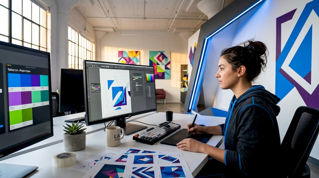
Convert all fonts to outlines. This is the single most commonly missed step. Common file rejection reasons include unconverted fonts, which cause characters to disappear or substitute when the print operator’s software lacks your typeface. In Illustrator, select all text and use Type > Create Outlines. In Photoshop, rasterize text layers before export.
Respect minimum line thickness. Fine lines look elegant on screen but disappear or bleed in print:
- DTF minimum line thickness: 0.2 mm at 300 DPI is the floor. Thinner lines may not reproduce.
- Embroidery minimum line width: 1mm lines and 6mm text height are required minimums, since anything smaller cannot be stitched cleanly.
- Screen printing: Lines below 0.5 pt tend to fill in with ink, especially on soft hand prints.
Manage gradients and shadows by print method. Gradients work beautifully in DTG and DTF because the printer operates essentially like an inkjet. Embroidery is a completely different story. Gradients and shadows must be removed from embroidery files because thread cannot blend colors the way ink does. Solid fills and strong outlines translate best to stitched output.
Use Pantone references for screen printing. When you hand off a screen print file, your printer mixes physical inks to match your colors. Generic RGB values give them nothing to work from. Pantone coated references give them an exact ink formula. Always note the Pantone code alongside each color layer.
Pro Tip: Test your transparency cutout by temporarily placing a black rectangle behind your artwork layer. Any white fringe or halo around the design edges will show immediately. Fix those pixel edges before export, not after.
For a deeper look at how DTG printing works, understanding the technical process helps you anticipate what the printer needs from your file.
4. Organize and export final files for production
Correct file setup means nothing if the export step introduces new problems. Export is where compression artifacts, missing transparency, and interlacing errors enter the picture.
Follow this checklist before submitting any file:
- Confirm document resolution is 300 DPI at actual print dimensions.
- Verify color mode matches the print method (sRGB for DTG/DTF, CMYK or spot for screen print).
- Check that all fonts are converted to outlines or rasterized.
- Test transparency by placing a dark background beneath the design layer.
- Export PNG with transparency enabled and interlacing turned off. Interlaced PNGs can cause display and printing errors in RIP software.
- Open the exported file in a standalone viewer (Preview, Windows Photos) at 100% scale and inspect edges.
- Name files clearly: include the garment color, print location, and size in the filename.
Gang sheet organization saves money on DTF runs. Gang sheets with 1 to 2 cm spacing between designs allow the cutter to separate prints cleanly without clipping edges. Cramming designs together to save film costs causes more cutting errors than the savings are worth.
Leave bleed margins when your design extends to the edge of the transfer. Most DTF providers want at least 3 mm of bleed beyond the cut line to account for slight registration shifts.
Pro Tip: Never deliver a JPEG of a design that originally had transparency. Even one save-to-JPEG cycle permanently merges all layers onto a white background. Keep your master file in PSD, AI, or TIFF and export fresh each time.
If you are mocking up designs before sending to production, learning how to mock up apparel designs accurately will show you whether your file will work before a single shirt gets printed.
5. Common pitfalls and how to fix them fast
Even experienced designers submit files that bounce back. Knowing the symptoms speeds up the fix.
Resolution flagged as too low. The file is probably correct in the design software but was exported at screen resolution (72 or 96 DPI). Re-export directly from the original document, not from a screenshot or web preview.
White halos on dark garments. Leftover white pixels cause halos on dark fabric. Use the magic wand or select-by-color tool to find and delete stray white areas. Then re-export with transparency.
Missing or substituted text. Fonts were not outlined. Open the original file, convert all text to outlines or curves, and re-export.
Dull or shifted colors after printing. The file was submitted in the wrong color mode. sRGB artwork sent to a screen printer expecting CMYK will look washed out. Rebuild the color mode in your software before exporting again.
File rejected outright by the print provider. Check the format first. Common rejection triggers include:
- JPEG submitted where PNG with transparency was required
- RGB file submitted for screen printing
- Resolution below 300 DPI at print size
- Live editable fonts in a vector file rather than outlined paths
Addressing these at the start of your workflow, rather than after a rejection, is the core habit that separates brands that run smoothly from those that chase every order.
What I have learned from years of watching print files succeed and fail
I have reviewed thousands of files across every print method, from single-color screen prints to 12-color DTF transfers. My honest take: most production failures trace back to a single decision made at the very beginning of a project, which is designing at a small canvas size with the plan to upscale later.
Upscaling ruins quality every time. There is no algorithm that genuinely recovers missing pixel data, no matter what the software preview suggests. I have seen brands spend days reworking files they built at 1,000 pixels wide expecting to blow them up to a 4,500-pixel print. The result is always a blurry garment and a frustrated client.
My actual workflow starts with a layered vector file for any design that might ever appear on a screen-printed or embroidered piece. Vectors cost nothing extra to set up and save hours when the same logo needs to go on a hat, a jacket, and a banner. Thinking like the person who operates the press, rather than just the person who designs the graphic, is the mental shift that makes files production-ready consistently.
The checklist approach is not bureaucratic. It is the fastest path to getting prints right the first time. One missed step in a 15-item process creates a two-day delay. Check the file, ship it once, get it done.
— Christian
Ready to print? Tektonla makes it straightforward
When your files are properly prepared, the right print partner makes everything else smooth. Tektonla, based in Downtown Los Angeles, handles DTG, DTF, screen printing, and embroidery with fast turnarounds and no minimum order requirements on blanks. Whether you are testing a first run on the Printers Shirt or building out a garment-dyed collection with the Garment Dye Shirt 3.0, your correctly prepared files translate directly into vibrant, professional results. Tektonla’s team reviews artwork before production runs to catch any issues early, which means fewer surprises and faster delivery from proof to finished garment.
FAQ
What DPI should custom clothing print files be?
Set your file to 300 DPI at the actual intended print size. Pixel dimensions at that scale are what matter, not just the DPI metadata in the file header.
What file format is best for DTG and DTF printing?
PNG with a transparent background is the standard for both DTG and DTF. TIFF also works for DTF when you need lossless quality without JPEG compression artifacts.
Why does my design show white halos on dark shirts?
Halos appear when white or near-white pixels remain around the artwork edges after export. The fix is to carefully remove those fringe pixels in your editing software and re-export with a clean transparent background.
Do I need to convert fonts before submitting a print file?
Yes. Unconverted fonts are one of the top causes of file rejection. Convert all text to outlines in Illustrator or rasterize text layers in Photoshop before your final export.
Can I use JPEG files for custom apparel printing?
JPEG is not recommended. It uses lossy compression that degrades edge quality and cannot carry transparency, which means it will produce a white background around your design on any garment.