


BLUF: For most adult tees, place the top of a center-chest print about 3 inches below the collar seam. Left-chest logos usually run 3–4 inches wide, positioned roughly 7–9 inches down from the shoulder point. Full-front graphics land 10–12 inches wide with the top edge 2–3 inches below the collar, and full-back designs run 10–14 inches wide starting 2–3 inches below the back collar.
These are starting points, not laws. Fabric stretch, garment fit, and your print method will all nudge these numbers up or down. Here’s the quick-reference version to pin above your workstation:
- Center chest: top edge ~3" below collar, width 8–10"
- Left chest: 3–4" wide, ~7–9" from shoulder point
- Full front: 10–12" wide, top edge 2–3" below collar
- Full back: 10–14" wide, 2–3" below back collar
- Sleeve hits: 2–4" wide, positioned 1–3" above the sleeve hem
Key Takeaways
Correct print placement depends on measuring from a fixed anchor, like the collar seam or shoulder point, and confirming it on a worn sample before full production.
| Point | Details |
|---|---|
| Use fixed anchors | Measure from the collar seam or shoulder point, never by eye, for repeatable results. |
| Follow the size chart | Center chest sits ~3" below the collar; left chest runs 3–4" wide, ~7–9" from the shoulder. |
| Grade up for larger sizes | Increase print size roughly 10–15% for 2XL, 3XL, and oversized or drop-shoulder fits. |
| Match method to placement | Embroidery favors smaller marks; screen printing needs safe registration margins; DTG/DTF need bleed allowance. |
| Sample before bulk production | Tekton LA offers no-minimum samples across DTG, DTF, screen printing, and embroidery to confirm placement first. |
Table of Contents
- What Are the Standard T-Shirt Print Placement Measurements?
- How Do You Measure and Mark Placement on a Flat Shirt?
- How Should Placement Change Across Sizes and Fits?
- How Do Fabric and Print Method Affect Placement?
- What Are the Most Common Print Placement Mistakes?
- Tekton LA’s Proofing Process for Placement Accuracy
- Seeing Placement in Practice Across Shirt Styles
- How Does Shirt Style Change Placement Decisions?
- Does Body Shape Change How Placement Looks?
- What Are the Rules for Multiple Prints on One Shirt?
- How Do You Place Wrap-Around or Asymmetric Designs?
- Get a Sample Before You Commit to a Full Print Run
- Frequently Asked Questions
- Sources
What Are the Standard T-Shirt Print Placement Measurements?
A size chart only earns its keep if it matches what actually ships. The numbers below reflect what most decorators use across DTG, DTF, screen printing, and embroidery, adjusted for adult and youth blanks. Treat this as your master reference for t-shirt print placement on any standard crew-neck order.
Center-chest prints on adult tees typically sit about 3 inches below the collar and run 8 to 10 inches wide, with full-front graphics extending to 10–12 inches. Left-chest logos, the classic “pocket” position, are usually 3 to 4 inches on the longest side, placed 5.5 to 8 inches down from the shoulder seam or about 3–4 inches from the collar depending on the blank’s cut.
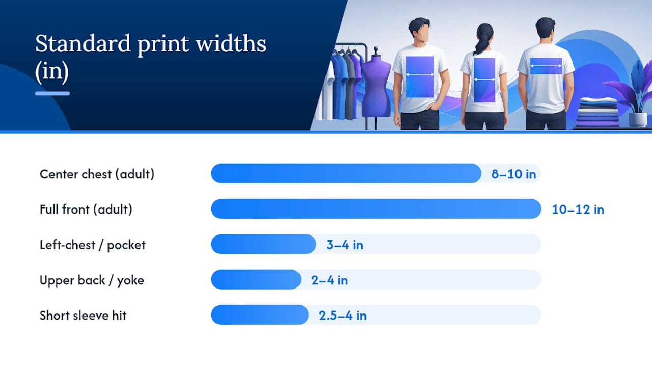
Full-back placements typically start 2 to 3 inches below the back collar seam and scale with garment size, while upper-back or yoke logos sit closer to the collar at 1–2 inches and stay narrow, usually 2–4 inches wide. Sleeve graphics need more restraint than people expect: a short-sleeve hit works best at 2.5 to 4 inches wide, placed 1 to 3 inches above the hem and centered on the outer panel, away from the underarm curve.
A few production notes that don’t fit neatly into a table row:
- Keep at least 1 inch of clearance from any side seam on chest graphics; anything tighter risks pulling or puckering during heat application.
- Standard platens for screen printing and DTG top out around 14x16 inches, so full-front designs rarely exceed that footprint even on 3XL blanks.
- For S–M sizes, stay at the low end of every width range. For L–XL, use the midpoint. For 2XL and up, size up toward the top of the range or the print looks lost on the larger chest panel.
Pro Tip: Always build in a 0.25 inch clear margin (bleed) around DTF transfers and embroidery digitizing files. Transfers shift slightly during pressing, and embroidery pulls fabric inward as stitches lock in, so that buffer keeps your edges clean instead of crowding a seam or collar rib.
How Do You Measure and Mark Placement on a Flat Shirt?
You don’t need fancy equipment for this, just consistent landmarks. Grab a T-shirt ruler (the kind with placement guides printed on it), a soft measuring tape, tailor’s chalk, and a roll of masking tape for holding a printed template steady. A large T-square helps square up the centerline on wider full-front designs.
- Lay the shirt flat, front side up, and smooth out the shoulders so both sides sit even.
- Fold the shirt in half vertically to find the true centerline, and press a light crease or mark it with chalk.
- Choose your anchor: for center-chest and full-front work, measure down from the collar seam; for left-chest logos, measure down from the shoulder seam at the shoulder point instead.
- Mark the top edge of your design area with chalk or a strip of tape, then measure the width outward from the centerline in both directions to confirm it’s symmetrical.
- Place your printed placement guide (paper template cut to the exact art dimensions) on the marked area and check it against the side seams and armpit for clearance.
This collar-seam-and-centerline method is what most decorators default to because it’s repeatable across different operators and shifts. Once you’ve marked and taped the template, photograph the flat-lay straight overhead, then put the shirt on a mannequin or a person and shoot it worn. Compare both images for alignment: does the design look centered when it’s on a body, not just on a table? Check proximity to the collar, symmetry against the centerline, and clearance from the side seams before you send anything to press.
Pro Tip: Keep your placement templates as labeled print files, not just handwritten notes. If you’re batching orders, a print file setup guide saves real time by giving your whole team the same reference instead of eyeballing it fresh each order.
How Should Placement Change Across Sizes and Fits?
One artwork file rarely works cleanly from a youth small to an adult 3XL. Here’s where most brands draw the line and how to adjust when they cross it.
- S through XL: one artwork file usually works fine if you center it consistently using the shoulder or collar anchor; the chest width difference between these sizes is modest enough that the same graphic reads correctly.
- 2XL and 3XL: grade the artwork up. Designers commonly increase print size by about 10 to 15 percent on boxier, wider blanks so the design doesn’t look shrunken against the extra fabric real estate.
- Oversized and drop-shoulder cuts: these need the same 10–15% bump even at “regular” size labels, since the body width runs larger than a standard fit at the same size tag.
- Slim or ladies’ cuts: go the other direction, reducing width slightly (roughly 5–10%) so the graphic doesn’t crowd the narrower chest panel or wrap into the side seam.
- V-neck and scoop-neck styles: shift the top-of-design down 1–2 inches from your standard collar offset, since the lower neckline changes where the eye naturally lands, and test any small text at actual size to confirm it stays legible once shifted.
How Do Fabric and Print Method Affect Placement?
Placement math changes the moment you factor in what the shirt is made of and how you’re printing it. A tri-blend athletic tee behaves nothing like a heavyweight cotton crew, and ignoring that gap is one of the fastest ways to end up with a design that looked perfect on screen and off-center after one wash.
Stretchy athletic blends shift under tension. A design measured perfectly on a flat, relaxed garment can visually drift once the wearer moves, because the knit stretches unevenly across the chest and shoulders. Build in a little more vertical offset margin on performance fabrics than you would on stable cotton.
Each print method carries its own constraints, and understanding them upfront prevents rework:
- Embroidery needs smaller, simpler marks. Fine detail and small text get lost or distort once stitch density takes over, so keep left-chest embroidery logos on the compact end of the range.
- Screen printing requires safe registration margins between colors and a hard limit tied to plate size. Leave extra edge space so registration drift doesn’t push ink past your intended border.
- DTG and DTF preserve fine detail well but need attention to bleed and fabric color; dark garments need white underbase layers that can subtly change how crisp small text reads at the edges.
For any new fabric-method pairing, always request a physical test print before committing to a full run. Wash-sensitive fabrics also shrink, so allow 0.25–0.5 inch of placement tolerance to account for shift after the first laundering. If you want the fuller rundown on how each garment printing technique handles detail and durability, it’s worth reading before locking your art files.
Pro Tip: *Never approve final placement off a digital mockup alone if you’re switching fabric or method for the first time.
What Are the Most Common Print Placement Mistakes?
Most placement problems trace back to a handful of repeat offenders, and nearly all of them are fixable before you print a full batch.
- Print sits too high, crowding the collar. Move the top edge down 0.5–1 inch and remeasure from the collar seam, not the shoulder tip.
- Print sits too low, drifting toward the chest’s widest point. Shift up 1–2 inches; this is especially common on tall-body designs that were sized for a flat template but not tested worn.
- Design wraps into the side seam. Cap the width by size class instead of using one fixed width across S–3XL, and recheck the 1-inch seam clearance rule.
- Left-chest logo lands over or near a pocket seam. Shift horizontally away from the seam line; printing directly over a seam distorts the image and stresses the fabric.
- Full-back design creeps into the hem. Recalculate from the back collar down, not up from the hem, since hem length varies more between blanks than collar position does.
Before any order goes to production, run this checklist: confirm file specs match your print method’s requirements, confirm the placement measurements against your chart, get a single-sample sign-off from whoever approved the design, and run one wash test if the fabric is wash-sensitive or unfamiliar.
Tekton LA’s Proofing Process for Placement Accuracy
Getting placement right on paper is one thing. Getting it right on a press, at scale, across a hundred units, is another. Tekton LA runs every custom order through a four-step proofing workflow before bulk production starts: file check, placement template check, physical sample, and a color-and-placement sign-off.
A misaligned graphic on a bulk run isn’t a small fix. It’s a reprint, a delay, and a client who now questions everything else about the order. Catching it on a single sample costs you one shirt and twenty minutes.
Here’s what that means for you as the customer:
- No-minimum sample orders, so you can validate placement on one shirt before committing to fifty or five hundred
- DTG, DTF, screen printing, and embroidery capability under one roof, so placement guidance stays consistent across methods
- Private-label and woven-label options if you need placement decisions to extend to interior branding, not just the exterior graphic
- Eco-friendly, locally sourced blanks and garment dyeing for brands that want sustainable production without sacrificing turnaround
Printers should generally follow your exact measured placement rather than “eyeball centering,” unless you’ve explicitly told them minor centering adjustments are fine for irregular seams.
Seeing Placement in Practice Across Shirt Styles
Numbers on a chart only tell half the story until you see how they sit on an actual garment. A center-chest graphic on a standard crew neck reads as bold and confident because the collar frames it evenly on both sides. Move that same design onto a raglan or baseball tee with contrast sleeves, and the eye is drawn differently, so many designers nudge the placement slightly higher to balance against the sleeve color block.
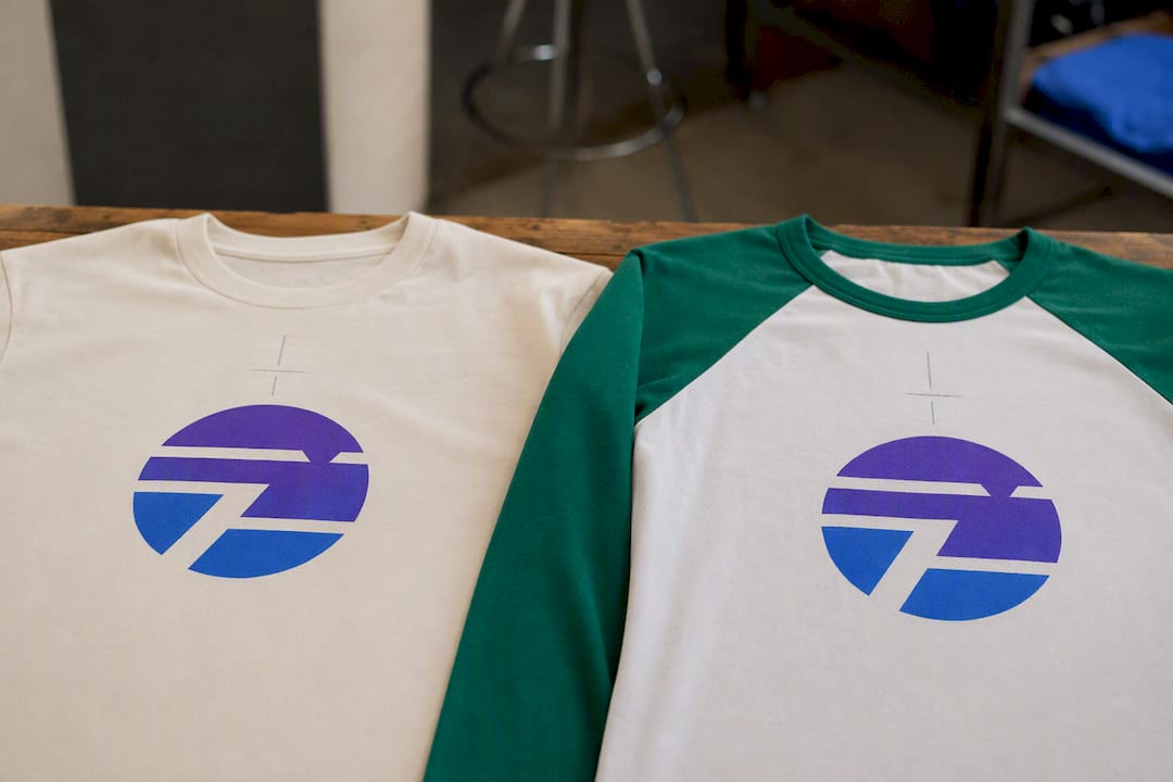
Full-back designs read best when photographed or previewed on a straight-on worn shot rather than a flat mockup, because the natural curve of the shoulders and spine changes how width is perceived. A 12-inch-wide design that looks proportionate on a flat table can look narrower once it’s stretched across a person’s actual back.
Left-chest placement is the one style most people get wrong in mockups: they center it visually rather than measuring it from the shoulder seam, which throws it off on camera even when it looks fine on the flat garment. Comparing a flat-lay photo against a worn photo, side by side, is the fastest way to catch this before a full print run.
Sleeve hits deserve their own visual check too. What looks like a clean 3-inch mark on a folded sleeve can end up wrapping awkwardly around the arm’s curve once worn, especially on fitted sleeves versus looser drop-shoulder cuts. If you’re building placement references for a team or client, keep both flat and worn reference photos in the same file so nobody has to guess which angle the measurement was based on.
How Does Shirt Style Change Placement Decisions?
Crew necks are the default for a reason: the placement math above works almost exactly as written, since the collar sits at a predictable, standardized height across most blanks.
V-necks change the geometry. Because the neckline dips lower, a center-chest design measured the standard 3 inches below the collar will actually sit closer to the neckline’s V-point than intended. Shift the top-of-design down 1–2 inches to restore the same visual balance you’d get on a crew neck, and always mock up small text at true size since the narrower vertical space above the V can crowd short headlines.
Tank tops and muscle tees compress the printable area further. Left-chest logos usually need to shrink slightly, closer to 2.5–3 inches wide instead of the standard 3–4, because the armhole cuts in tighter and reduces usable chest width. Full-front designs on tanks also tend to sit higher than on a tee, since there’s less torso fabric below the design before it hits the hem.
Scoop necks split the difference between crew and V-neck. The wider, shallower curve means side-to-side placement stays close to standard, but vertical placement should still drop by about an inch to avoid visually competing with the neckline curve.
If you’re deciding between styles for a merch run or team order, the logo placement standards for team and corporate apparel are worth a look, since consistent placement across a mixed order of crew necks, V-necks, and tanks is one of the more common requests brands run into.
Does Body Shape Change How Placement Looks?
Every measurement in this guide assumes a flat, relaxed garment. Bodies aren’t flat. A center-chest design measured perfectly on a table will sit differently on a broad-shouldered frame than it does on a narrower build, simply because the fabric drapes and stretches differently across the chest.
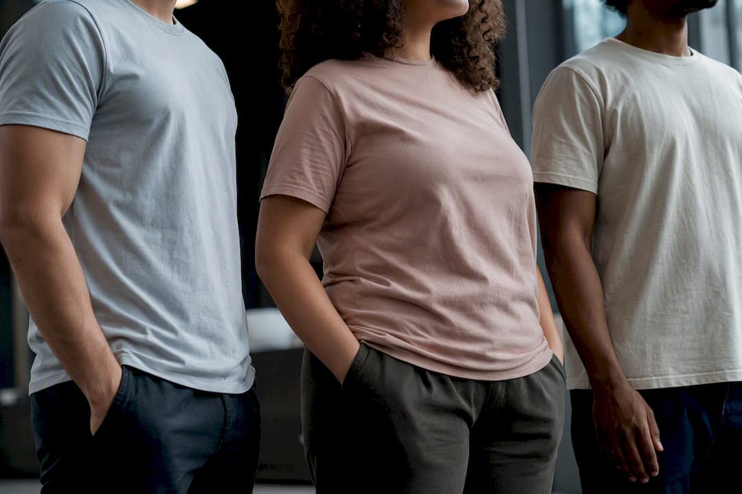
Posture matters more than most people account for. Someone standing with shoulders back presents a design squarely, while a relaxed or forward posture can make the same graphic appear to sit slightly higher or angled. This is exactly why photographing a worn mockup matters as much as the flat measurement: it’s the only way to catch how the print reads in motion or at rest on an actual person, not just a mannequin.
Chest size and torso length shift perceived placement too. A design centered 3 inches below the collar on a size-medium frame can visually creep upward on a larger chest simply because there’s more fabric expansion below the design than above it.
None of this means you need a different measurement for every body type; it means your sample and proofing step should include checking the design worn, not just flat, before you commit to a full production run.
What Are the Rules for Multiple Prints on One Shirt?
Once you’re placing more than one graphic, spacing and hierarchy matter more than any single placement measurement. The goal is making sure a secondary print supports the main design instead of competing with it for attention.
A front-and-back combination is the most common multi-print setup, and it works because the two placements are physically separated by the entire garment, so there’s no visual competition. Front-plus-sleeve or front-plus-left-chest combinations need more care: keep the secondary placement (sleeve or left chest) noticeably smaller and simpler than the primary graphic so the eye knows which one to look at first. Secondary placements like upper-back or sleeve hits work best carrying supporting details, like a website, hashtag, or small logo, rather than competing with a full front or back design for the same visual weight.
When combining a left-chest logo with a full-back design, standard spacing conventions keep them in their own dedicated zones, so there’s no minimum gap calculation needed between them. The bigger risk with multi-print orders is inconsistent scaling: if the left-chest logo is sized differently across a batch of shirts because each print station eyeballed it, the mismatch shows up fast once the shirts are side by side at an event. Lock every placement to the measured chart, not visual estimation, especially on bulk multi-location print orders.
How Do You Place Wrap-Around or Asymmetric Designs?
Wrap-around prints, ones that extend from the front panel around the side seam to the back, break most of the standard measurement rules above because they’re not meant to sit within a single flat zone. These need to be planned on a 3D mockup or a curved-panel template rather than a flat centerline measurement, since the design has to account for how the fabric curves around the wearer’s torso.
The safest approach is prototyping on an actual sample garment early, not just a flat digital file, because wrap-around placement is one of the few cases where a flat mockup genuinely can’t predict how the final print will look once it curves around a body.
Asymmetric designs, an off-center chest graphic or a diagonal placement crossing from shoulder to hip, still benefit from the same landmark logic as symmetric designs. Anchor one clear reference point (usually the shoulder seam or collar) even though the design itself isn’t centered, so reproducibility across a full production run stays consistent. Without a fixed anchor, asymmetric placement tends to drift shirt to shirt because there’s no symmetrical fold-and-check method to catch errors.
For anything unusual, order a single sample first. Standard placement math gives you a reliable starting point for wrap-around and asymmetric work, but the final call almost always comes down to how it looks on an actual worn garment.
Why Placement Is the Real Signal of Craftsmanship
Anyone can print a sharp graphic. What separates a shirt that looks professional from one that looks like a first attempt is almost always placement, not artwork quality. A perfectly designed logo sitting half an inch too high reads as careless no matter how good the design itself is. Always sample before you commit to a full run, and treat placement sign-off as seriously as color approval.
Get a Sample Before You Commit to a Full Print Run
Every measurement in this guide gets you close. A physical sample gets you certain. Tekton LA runs no-minimum sample orders across DTG, DTF, screen printing, and embroidery, so you can hold the actual shirt in your hands and check placement against a real body before locking in fifty, five hundred, or five thousand units.
Requesting a proof is straightforward: send your print-ready art file with the placement measurements marked (use the collar-seam or shoulder-point anchors covered above), pick your blank, and specify the print method. A single proof sample typically turns around faster than a full production run, since it’s one unit rather than a full batch queue. From there, you decide: approve for bulk production, request an adjustment, or test a different fabric and method combination on a second sample.
If you’re deciding on a blank to start with, the Printers Shirt is a solid baseline for testing standard placement measurements, while the Garment Dye Shirt is worth checking if you want to see how a dyed, softer-hand fabric affects how a print sits and settles after wash. Private-label and woven-label options are available if your placement needs extend to interior branding as well. Head to Tekton LA to start a sample order or request a production quote.
Frequently Asked Questions
What is the standard placement for a center-chest print? Most adult tees place the top edge of a center-chest design about 3 inches below the collar seam, with widths typically running 8 to 10 inches for standard designs and up to 12 inches for full-front graphics.
Where should a left-chest logo sit on a shirt? Left-chest logos usually run 3 to 4 inches wide and sit roughly 7 to 9 inches down from the shoulder point, or about 3 to 4 inches from the collar depending on the blank.
How do I adjust print placement for a 2XL or 3XL shirt?
Does print placement change for V-neck shirts? Yes. Shift the top-of-design down 1 to 2 inches from your standard crew-neck offset, since the lower neckline changes where the design visually sits relative to the collar.
What is the biggest print placement mistake to avoid? Printing too close to a side seam or pocket seam is one of the most common errors. Keep at least 1 inch of clearance from any seam to prevent distortion during pressing or stitching.
Sources
- Placement t shirt design size chart: 15 print rules
- The ultimate T-shirt design placement guide for small businesses
- Design Placement Tips