


Your branded hoodie arrives with the logo slightly off-center, printed in a color that looks nothing like your brand’s signature navy, and stretched because someone used a low-resolution file. That scenario plays out constantly when custom logo apparel brand standards are either absent or ignored. The result is wasted budget, frustrated employees, and merchandise that quietly undermines the professional image you’ve spent years building. This guide gives you a practical framework for setting standards that protect your brand every time fabric meets ink.
Table of Contents
- Key takeaways
- Custom logo apparel brand standards: the foundation
- Choosing apparel that fits your brand identity
- Logo placement, sizing, and print method standards
- Avoiding production errors before you place the order
- My take on consistency versus control
- Put your brand standards into production with Tektonla
- FAQ
Key takeaways
| Point | Details |
|---|---|
| Start with verified brand assets | Collect vector logo files, exact color codes, and approved typography before contacting any vendor. |
| Match apparel type to use case | Select garments based on their purpose first. Staff uniforms, event giveaways, and premium gifts each demand different fabric and print specs. |
| Define placement and sizing rules | Establish approved logo placement zones and maximum size ratios per garment type to prevent inconsistent results. |
| Choose the right print method | Screen printing, embroidery, and heat transfer each suit different order sizes and artwork styles. Match the method to the job. |
| Build a proof approval workflow | Require mockup sign-off before every production run to catch file, color, and placement errors early. |
Custom logo apparel brand standards: the foundation
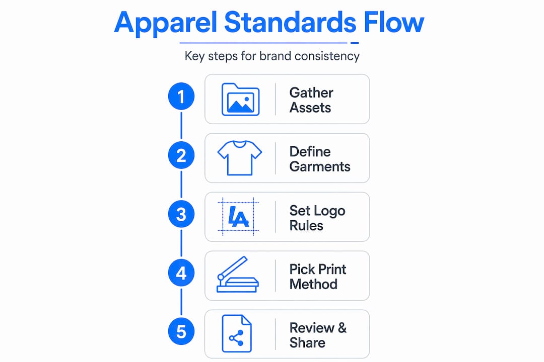
Before you write a single spec or send a single file to a printer, you need to assemble the right brand assets. Skipping this step is the single most common reason branded apparel orders go sideways.
The non-negotiable starting point is your logo in a true vector format. Vector files like .AI, .EPS, and .SVG scale to any size without quality loss, which is critical whether you’re printing a 2-inch chest logo or a full-back graphic. A raster PNG or JPEG might look fine on screen but will produce blurry, pixelated output when handed to a screen printer or embroidery shop.
Beyond the logo file itself, you need the following locked down:
- Pantone (PMS) color codes for exact color matching, not just hex codes
- CMYK and RGB breakdowns for print and digital use respectively
- Approved logo variations (full color, single color, reversed/white, and grayscale)
- Typography specs including font names, weights, and minimum readable sizes
- Clear space rules specifying how much margin must surround the logo in every direction
One more thing most brand managers overlook: gather your apparel use cases before you finalize the standards document. Branded apparel planned by use case first produces better results across fabric, placement, and durability decisions than a one-size-fits-all approach. A trade show giveaway T-shirt has different requirements than a uniform worn by your customer service team 40 hours a week.
Pro Tip: Create a single shared folder containing all approved logo files, color codes, and brand guidelines. Send that folder, not individual files, to every vendor. It removes ambiguity and reduces back-and-forth.
Choosing apparel that fits your brand identity
Not all garments carry brand identity the same way. A polo shirt signals something completely different from a unisex tee, and your standards need to reflect that.
T-shirts work well for promotions and giveaways, polos serve customer-facing staff more effectively, and jackets deliver a premium brand statement for higher-value moments. Understanding this distinction prevents the all-too-common mistake of ordering the same style for every scenario and wondering why some pieces feel off-brand.
Fabric matters more than most brand managers expect. Cotton holds screen-printed ink beautifully and photographs well for catalogs or social content. Polyester performs better in active or outdoor environments and accepts sublimation printing with exceptional color vibrancy. However, polyester also reflects light differently, which means your brand color may read slightly different on a poly performance shirt than on a heavyweight cotton tee. Your standards document should acknowledge this and specify acceptable fabric types per use case rather than prescribing a single fabric for all applications.
A few decisions to document for each apparel category:
- Approved garment styles (crew neck, polo, quarter-zip, etc.)
- Acceptable fabric compositions and minimum weight specifications
- Color palette for garments (which brand colors can serve as garment colors, and which should never appear as a background)
- Prohibited styles that conflict with brand positioning
Well-designed branded uniforms increase brand awareness and employee pride, but that only holds true when the garment itself reflects the quality level your brand represents. A thin, shapeless shirt with a beautiful logo still reads as cheap. Fabric selection is branding.
Pro Tip: When ordering uniform pieces employees wear regularly, involve a small sample group in fit and comfort testing before finalizing the spec. Apparel people won’t wear defeats the entire purpose.
Logo placement, sizing, and print method standards
This is where most apparel branding guidelines collapse. Even brands with solid logo files and clear color codes fail here because they never defined where the logo goes or how big it should be.

Placement standards by garment
Standard placements you should define in your spec sheet include the left chest (the most common professional position), full front center, full back center, sleeve placement, and collar or hem tags for private label use. Each placement serves a different visual purpose. The left chest position reads as professional and restrained. A full-back print maximizes visibility at events. A sleeve logo works well as a secondary mark on premium pieces.
Sizing rules that prevent common mistakes
Overly large logos reduce willingness to wear apparel and create an amateur look rather than a polished one. A general rule of thumb: left chest logos should fall between 3 and 4 inches wide. Full front logos should stay within 10 to 12 inches. Full back graphics can reach 12 to 14 inches. Document maximum and minimum dimensions in your standards and include visual reference examples so vendors have zero ambiguity.
Matching print method to the application
Your choice of printing and decoration methods has a direct impact on how your brand standards translate to the finished garment. Here is a side-by-side comparison:
| Method | Best for | Limitations |
|---|---|---|
| Screen printing | Large runs, simple artwork, bold colors | Setup costs make small runs expensive |
| Embroidery | Professional uniforms, polo logos, caps | Not ideal for fine details or gradients |
| Heat transfer (DTF) | Short runs, complex artwork, full color | Less durable on high-wash garments |
| Direct-to-garment (DTG) | Photographic designs, small batches | Color vibrancy varies on dark fabrics |
Screen printing suits large runs with simple artwork, while embroidery delivers a polished, tactile finish ideal for logos on professional wear, and heat transfer handles short runs and detailed designs effectively. Specify in your brand guidelines which methods are approved for which garment types. This prevents a vendor from embroidering a delicate, gradient-heavy logo that was never designed for that technique.
Avoiding production errors before you place the order
The most expensive mistakes in custom apparel production happen before a single garment is decorated. Getting this stage right saves time, money, and brand credibility.
The most common production problems are predictable:
-
Low-resolution artwork files. A vendor works with what you send. Common production delays stem from low-resolution files, unclear color specs, missing fonts, and unapproved logo variants. Always send the vector source file.
-
Incorrect or unspecified colors. Telling a vendor “our blue” means nothing without a Pantone reference. Color drift across production runs is one of the most common brand consistency failures.
-
Missing placement specifications. “Center chest” is not a specification. Provide exact measurements from the collar or shoulder seam.
-
Unapproved logo variations. Someone on your team sends an old logo file, or the vendor recreates the logo from a low-resolution image. Establish a single approved source library and make clear that no other files are acceptable.
-
Skipping the proof review. A digital mockup review catches placement errors, sizing problems, and color issues before they are baked into 500 shirts. Require written sign-off on proofs before any production run begins. Tektonla’s guide on mocking up custom apparel designs walks through exactly what to look for at this stage.
Pro Tip: Build a pre-production checklist your team completes before sending any order to a vendor. Include file format confirmation, color code verification, placement measurements, and proof approval sign-off. Two minutes of checking prevents weeks of reprints.
Visual consistency across apparel matters more than chasing perfect logo replication across every material. A cotton tee and a nylon jacket will never render the same logo identically. Accept that reality in your standards and define a range of acceptable output rather than an impossible single standard.
My take on consistency versus control
I’ve worked with enough brand managers to know that the ones who build the most effective apparel programs are not the ones with the most rigid standards. They’re the ones who understand where flexibility actually serves the brand.
In my experience, the biggest mistake brand teams make is writing standards that work perfectly in theory but fall apart the moment they meet a real garment in a real production environment. You cannot hold a heavyweight fleece hoodie to the same color expectation as a lightweight cotton tee and declare it a failure when the output differs slightly. Different fabrics reflect light and absorb ink in different ways. A great apparel standard accounts for this rather than pretending it doesn’t exist.
What I’ve found actually works: define your non-negotiables tightly (logo file format, Pantone codes, approved placement zones) and give yourself structured flexibility on everything else. Success in clothing brand consistency comes from clear messaging and repeatable execution, not pixel-perfect control across every surface.
I’ve also seen brands dramatically improve brand perception by moving away from large, loud logos toward subtle, tonal treatments on premium pieces. A tonal embroidered logo on a garment dye shirt often communicates more quality and confidence than a full-chest print screaming the brand name. Sometimes restraint is the stronger brand move.
The other thing I’d tell any brand manager: your production partner is part of your brand standards team whether you treat them that way or not. The more clearly you communicate, the better your output. Build the relationship, share your guidelines proactively, and give feedback on every run. That feedback loop is what separates brands with consistent apparel programs from those constantly redoing orders.
— Christian
Put your brand standards into production with Tektonla
Setting standards is only half the work. The other half is finding a production partner who can actually execute them. Tektonla, based in Downtown Los Angeles, specializes in exactly this: translating your brand specifications into high-quality finished apparel with fast turnaround and no minimum order requirements on blanks.
Whether you need a premium printer’s shirt for your core team uniform program, a cost-effective screen print run for your next event, or a garment dye option that supports a more elevated brand aesthetic, Tektonla’s team works from your spec sheet to deliver consistent, brand-aligned results. Their services span screen printing, DTG, embroidery, DTF, and embossing, which means your production method choices are not limited by vendor capability.
FAQ
What are brand standards for custom logo apparel?
Brand standards for custom logo apparel are documented guidelines that define how your logo, colors, typography, and decoration should appear on garments. They cover file formats, approved placements, sizing rules, and acceptable print methods to keep all apparel consistent.
What file format should I use for custom clothing logo design?
Always provide vector files in .AI, .EPS, or .SVG format for custom clothing logo design. These formats scale without quality loss and prevent the blurring and pixelation that raster files produce in production.
How do I choose between screen printing and embroidery?
Screen printing works best for large quantities with bold, simple artwork. Embroidery delivers a more polished finish for smaller logos on uniforms and professional wear, but is not suitable for designs with fine gradients or photographic detail.
Why does my logo color look different across garment types?
Different fabrics absorb ink and reflect light differently, so exact color matching across cotton, polyester, and nylon is not always possible. Your brand standards should define acceptable color variation ranges rather than requiring a single identical output across all materials.
How can I prevent logo placement errors on bulk orders?
Provide exact placement measurements from a fixed reference point such as the collar seam, require a digital mockup proof before production begins, and get written sign-off on that proof before any garments are decorated.